20 Stunning Living Room Color Psychology Ideas That Transform Your Mood ♥ [Mood Magic]
What Is Living Room Color Psychology?
Living room color psychology is the study of how the colors in your living room shape your mood, energy, and the way the space feels. Every shade speaks a silent language: blue slows a racing mind, warm orange sparks conversation, and deep green steadies the nerves. At the heart of living room color psychology is one simple truth — you do not decorate with color, you feel with it.
These 20 living room color psychology ideas translate that science into real rooms. Each one pairs a color with the emotion it creates, so you can design with intent instead of guessing. Pick the feelings you want — calm, joy, drama, focus — and let the palette do the heavy lifting.
1. Calm Blue Walls for a Tranquil Reset
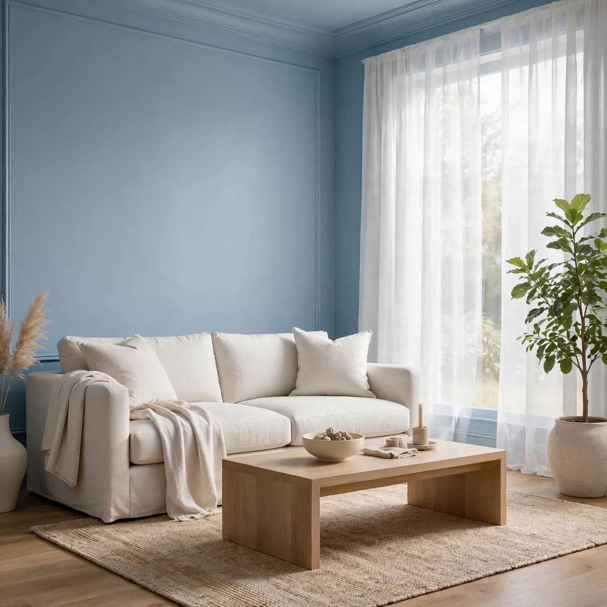
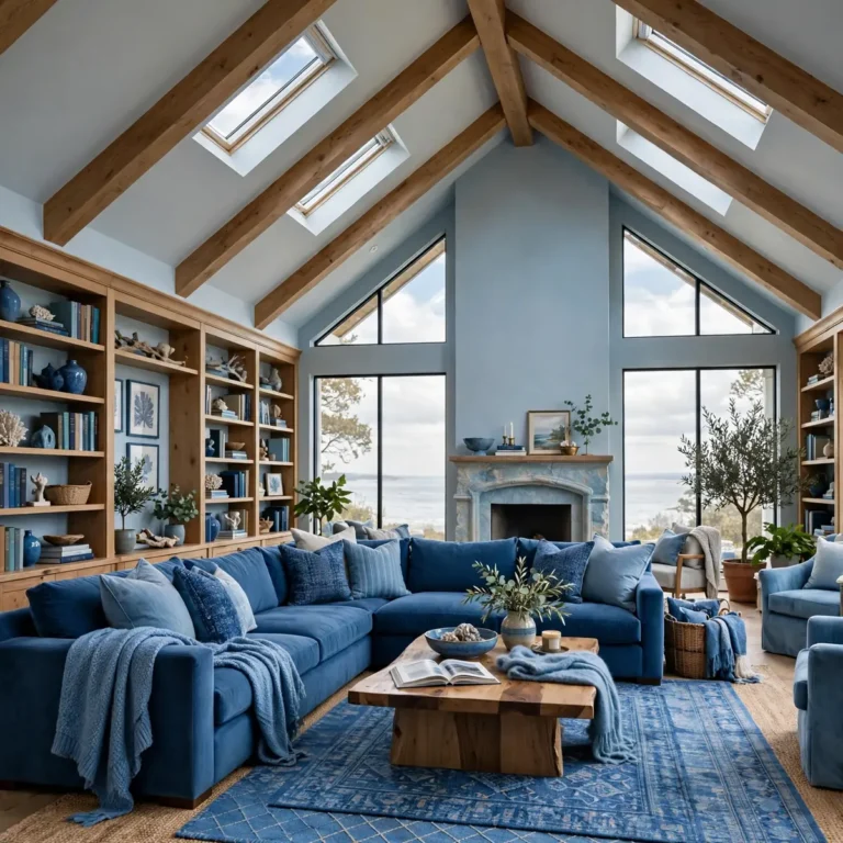
Blue is the great calmer of the color wheel — it measurably slows the heart rate and quiets mental noise, which makes it the classic choice for unwinding after long days. A dusty, muted blue on the walls feels cool without turning cold, especially when sunlight washes across it. In living room color psychology, blue signals trust and serenity, so it suits rooms meant for rest and easy conversation. For more blue-forward palettes, these blue living room ideas show the shade at its best.
Quick tips
- Choose muted, dusty blues over electric ones for a calmer effect.
- Balance cool walls with warm wood and soft textiles.
2. Energizing Burnt Orange for Lively Conversation

Burnt orange is the extrovert of the palette — warm, expressive, and wired for dialogue. Psychologically it encourages creativity and sociability, which is why it shines in rooms built for gathering. Keep it curated by muting the brightness with stone, raw linen, or matte black metal, so the energy reads bold but intentional rather than loud.
Quick tips
- Use burnt orange on one statement piece, not every surface.
- Warm golden-toned bulbs deepen its glow at night.
3. Grounding Sage Green for Natural Balance

Sage green borrows its psychology straight from nature: it reads as tranquil, balanced, and quietly sophisticated. It shifts warmer or cooler depending on what surrounds it, so it adapts to almost any scheme. Living room color psychology treats sage as the peacemaker — it softens stronger colors nearby and gives busy rooms a place to exhale.
Quick tips
- Pair sage with pale beige walls instead of stark white.
- Add one black-framed piece for definition and contrast.
4. Joyful Yellow for Everyday Optimism

Yellow is pure psychological sunshine — it triggers feelings of happiness, warmth, and mental clarity. Because it is so stimulating, it works best in doses: a velvet accent chair, a pair of cushions, or art that catches the morning light. Used this way, yellow lifts the whole room’s mood without overwhelming it.
Quick tips
- Keep yellows warm and golden; neon shades feel anxious, not happy.
- Anchor yellow accents with calm neutrals so they sing.
5. Sultry Navy for Bespoke Drama

Navy carries the psychology of a bespoke suit — serious, confident, and quietly dramatic. It anchors a room the way nothing else can, giving warm colors around it a high-end contrast to play against. In living room color psychology, navy signals depth and self-assurance, making it ideal for rooms that should feel grown-up and composed.
Quick tips
- Pair navy with off-white walls and brass accents.
- Use soft wall spotlights, not harsh overheads, on dark navy.
6. Quietly Luxe Emerald for Confident Calm

Emerald is deep, rich, and luxurious without ever shouting — the psychology of quiet confidence. It works best when allowed to reign solo, so resist surrounding it with other saturated colors. The formula is simple:
- Let the emerald piece be the room’s single jewel tone.
- Keep surroundings neutral — light taupe or ivory walls.
- Amplify it with vintage brass or gold details.
- Choose velvet or suede; the texture deepens the color.
Quick tips
- One emerald hero per room is plenty.
- Velvet suits emerald better than leather or flat cotton.
7. Tone-on-Tone Beige for Timeless Warmth
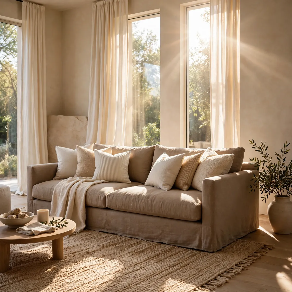
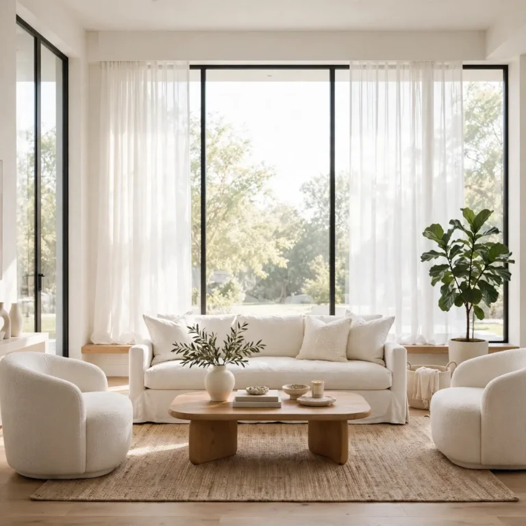
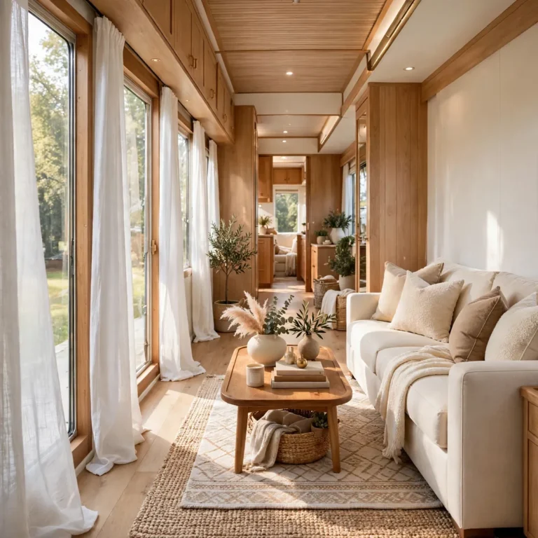
Beige is the underrated neutral of living room color psychology — psychologically it reads as dependable, warm, and endlessly livable. The secret is never using one flat beige: layer a deeper beige sofa against paler curtains and a textured rug so the room gains depth. Done this way, beige feels rich rather than boring, especially in naturally lit rooms.
Quick tips
- Layer at least three beige tones for depth.
- Mix textures — linen, wool, jute — to keep it interesting.
8. Adaptable Taupe With Warm Metal Touches
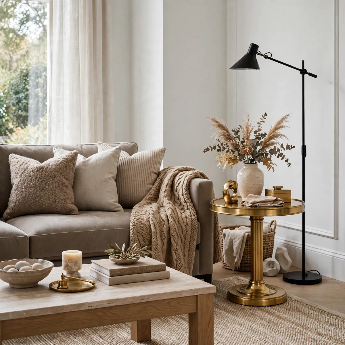
Taupe sits between warm and cool, which gives it a rare psychological flexibility — it adapts to whatever mood the room needs. It bridges crisp white walls and black fixtures beautifully, and warm brass or antique-gold accents draw out its earthy gray for a touch of luxury. Let rich textures lead and keep gray pairings light.
Quick tips
- Use taupe as the bridge between white and black elements.
- Add brass to warm it up; chrome cools it down.
9. Light-Lifting Cream for Small or Dim Rooms

Cream and ivory are psychological daylight — they reflect light, open up tight spaces, and make dim rooms feel airy and calm. Living room color psychology favors them for small rooms because the eye reads light colors as more space. Build interest through texture — bouclé, washed linen — rather than shine, and layer camel and off-white for gentle contrast.
Quick tips
- Choose matte finishes; gloss reads cold on pale walls.
- Layer camel tones so cream never feels flat.
10. Serene Muted Teal for Depth Without Weight

Muted teal delivers serenity with depth — calmer than saturated blues, richer than plain neutrals. Psychologically it blends blue’s calm with green’s balance, creating a color that soothes without sedating. Pair it with creamy off-white walls and medium-toned wood, and keep lighting warm and diffused for the full cocoon effect.
Quick tips
- Avoid cool LED bulbs; they flatten teal’s warmth.
- Subtle brass lighting amplifies the depth beautifully.
11. Balanced Misty Grey With Natural Textures

Misty grey is the great neutralizer — neither warm nor cold, it creates psychological balance and lets everything around it breathe. In living room color psychology it functions as a calm backdrop that makes textures the star. Layer multiple grey intensities to avoid flatness, then warm it with light oak, stone, rattan, and olive-toned greenery.
Quick tips
- Mix light, mid, and dark greys in one room.
- Natural materials keep grey from feeling sterile.
12. Warm Greige and Terracotta for Golden-Hour Richness
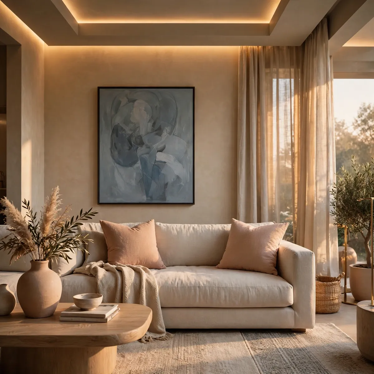
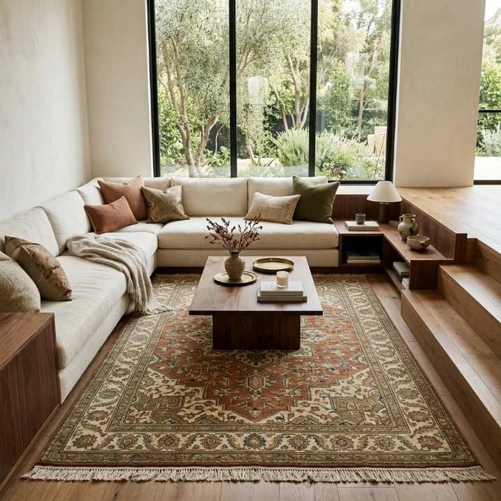
Warm greige with pale terracotta sits on the edge between neutral and evocative — psychologically it feels grounded yet quietly expressive. The pairing glows under warm indirect LED lighting, creating a permanent golden-hour richness. Balance it with cooler counterpoints like blue-gray art so the warmth never turns heavy.
Quick tips
- Use warm 2700K lighting to unlock the golden effect.
- One blue-gray accent keeps the palette breathing.
13. Soft Blush for Romantic Warmth
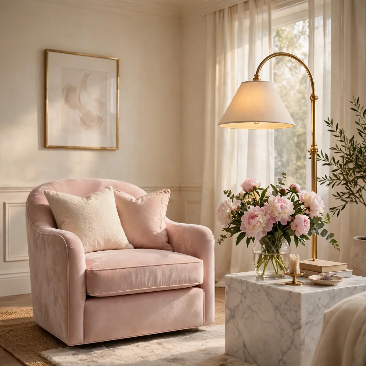
Blush pink speaks the psychology of tenderness — it softens a room’s edges and makes it feel nurturing and welcoming. Unlike bolder pinks, blush stays sophisticated, reading as warmth rather than sweetness. Living room color psychology places blush among the most disarming colors: guests relax faster in rooms that wear it well.
Quick tips
- Pair blush with warm ivory, not stark white.
- Brushed gold accents elevate blush instantly.
14. Terracotta Accents for Creative Warmth
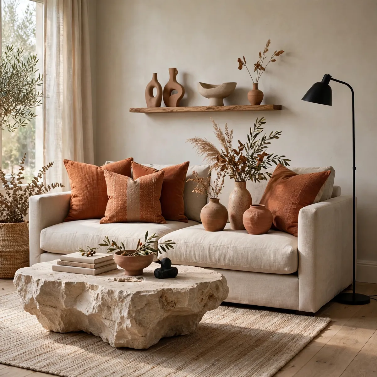
Where a full terracotta wall energizes, terracotta accents inspire — the same warm psychology in a quieter register. Pillows, ceramics, and art in sunbaked clay tones spark creativity without demanding attention. Mute them with stone, raw linen, or matte black metal so the look stays curated, and set them against pale greige walls.
Quick tips
- Repeat terracotta three times for a deliberate look.
- Matte finishes keep terracotta earthy, not glossy.
15. Matte Charcoal for Cocooning Depth

Charcoal is the psychology of the embrace — dark, enveloping, and deeply calming when done in matte finishes. It makes a living room feel like a private theater, perfect for slow evenings. Living room color psychology warns that dark colors need light to lean on: layer warm amber lamps and one light-toned rug so the cocoon never becomes a cave.
Quick tips
- Keep charcoal matte; gloss turns it harsh.
- Always pair dark walls with warm, layered lighting.
16. Cheerful Coral for Playful Energy

Coral blends pink’s warmth with orange’s vitality, creating a psychology of friendly playfulness. It makes rooms feel approachable and alive — ideal for family living rooms that should invite laughter. Because it is naturally upbeat, coral needs little help: a few well-placed accents against warm white walls do the whole job.
Quick tips
- Use coral in textiles and art, not permanent fixtures.
- Light wood furniture keeps coral feeling fresh.
17. Restful Lavender for Gentle Creativity

Lavender carries a rare double psychology — restful like blue, imaginative like purple. It quiets the mind while keeping creative thinking gently awake, which makes it perfect for reading corners and creative nooks. In living room color psychology, lavender works best softly: washed tones on textiles and art rather than saturated walls.
Quick tips
- Keep lavender muted; vivid purple feels restless.
- Pair with pale grey and ivory for serenity.
18. Regal Plum for Artistic Drama

Plum is color psychology’s creative aristocrat — deep, imaginative, and unapologetically dramatic. It signals originality and luxury, making it the choice for rooms with artistic ambition. One plum velvet chair or a single plum wall is enough; the color’s power comes from restraint, with warm champagne tones keeping it grounded.
Quick tips
- One plum moment per room — never more.
- Warm metallics stop plum from feeling cold.
19. Sunny Mustard for Confident Luxury

Mustard gold radiates the psychology of optimism with backbone — cheerful, but with the depth to feel luxurious rather than naive. It flatters skin tones, glows in lamplight, and gives neutral rooms an instant pulse. Living room color psychology treats mustard as controlled sunshine: all the joy of yellow, anchored by earthy richness.
Quick tips
- Mustard loves walnut wood and brass — pair generously.
- Keep surrounding walls warm white for maximum glow.
20. Color-Zone Each Corner by Its Job

Here is the most advanced move in living room color psychology, and it changes how the whole room functions: instead of one mood for the entire space, assign each zone its own psychological job. Give the reading corner calming blue or sage so the mind settles, dress the conversation area in warm terracotta or coral to spark dialogue, and keep the media wall in deep, receding charcoal or navy so the screen takes center stage without visual competition. The transitions matter — bridge the zones with a shared neutral like warm greige or natural wood so the room still reads as one cohesive space rather than three competing ones. Rugs are the easiest zoning tool: one rug per mood, each in its zone’s color story, instantly tells the brain where to shift gears. This approach works because our minds already associate places with feelings; color zoning simply makes those associations deliberate. A single open-plan living room can hold tranquility, energy, and focus at once — not by compromising on one average mood, but by giving every corner the exact emotion it was built for. When each zone does its psychological job, the whole room feels larger, calmer, and unmistakably yours.
Quick tips
- Use one rug per zone to anchor each mood.
- Bridge zones with a shared neutral for cohesion.
Frequently Asked Questions
What is living room color psychology?
Living room color psychology is the study of how the colors in a living room influence the mood, behavior, and comfort of the people in it. Warm colors like orange and terracotta energize and encourage conversation, cool colors like blue and green calm and relax, and deep tones like navy and charcoal add drama and coziness. Choosing colors with intent lets you design the feeling of the room, not just its look.
Which color is best for a relaxing living room?
Cool, muted colors are best for relaxation: dusty blue, sage green, and muted teal consistently rank as the most calming living room colors. They lower perceived stress and slow a busy mind. Keep them soft rather than saturated, and pair with warm neutrals and natural textures so the calm feels cozy rather than cold.
Can dark colors work in a small living room?
Yes — dark colors can make a small living room feel intimate and cocooning rather than cramped, as long as the lighting is layered and warm. Living room color psychology shows that deep navy or charcoal walls recede visually, which can actually make walls feel farther away. Add mirrors, warm lamps at multiple heights, and one light-toned element for balance.
How do I choose a sofa color using color psychology?
Start with the mood and purpose you want the room to serve, then match the sofa color to it: choose calming blue or green for a restful retreat, warm terracotta or mustard for a sociable gathering space, or deep navy or emerald for quiet luxury. Since the sofa is the room’s emotional anchor, its color sets the tone everything else follows — pick the feeling first, the fabric second.
The Mood-First Takeaway
Great rooms are not decorated — they are felt. Start with the emotions you want your living room to hold, then let living room color psychology translate those feelings into color: calm blues for rest, warm earth tones for connection, deep jewel tones for drama. When every shade has a job, the room stops being just beautiful and starts being yours. ♥