








Color Drenching Ideas for Rooms That Feel Calm and Cocooning
Color drenching is the practice of painting the walls, ceiling, trim, and sometimes the millwork and furniture of a room in one saturated color, so the whole space reads as a single immersive envelope rather than a collection of separate surfaces.
If you want the short answer: yes, it works beautifully when the color is muted and complex rather than bright, when finishes and textures vary inside that one color family, and when the lighting is warm and layered. Done that way, a drenched room feels calm, intentional, and cocooning — not flat, and not like a paint accident.
The reason color drenching has become one of the defining looks of 2026 is that it solves a problem many homes quietly have: rooms where every surface is a slightly different neutral, so nothing feels settled.
Drenching removes those visual interruptions. Baseboards, door frames, window casings, radiators, and built-ins stop competing with the walls, and the eye travels around the room without catching on contrast lines. That is also why it suits people who love color but dislike busy decorating. You get a strong point of view from paint alone, and the furniture and textiles can stay simple because the room itself is doing the work.
This guide walks through the idea from first principles — what it is, how it differs from an accent wall, how to choose a color, what works room by room, and the practical details (finishes, ceilings, lighting, testing) that decide whether the result looks luxurious or unfinished.
What Is Color Drenching, and How Is It Different From an Accent Wall?
An accent wall paints one wall a bold color and leaves the rest light, which draws the eye to a single plane and often makes the other walls feel like an afterthought.
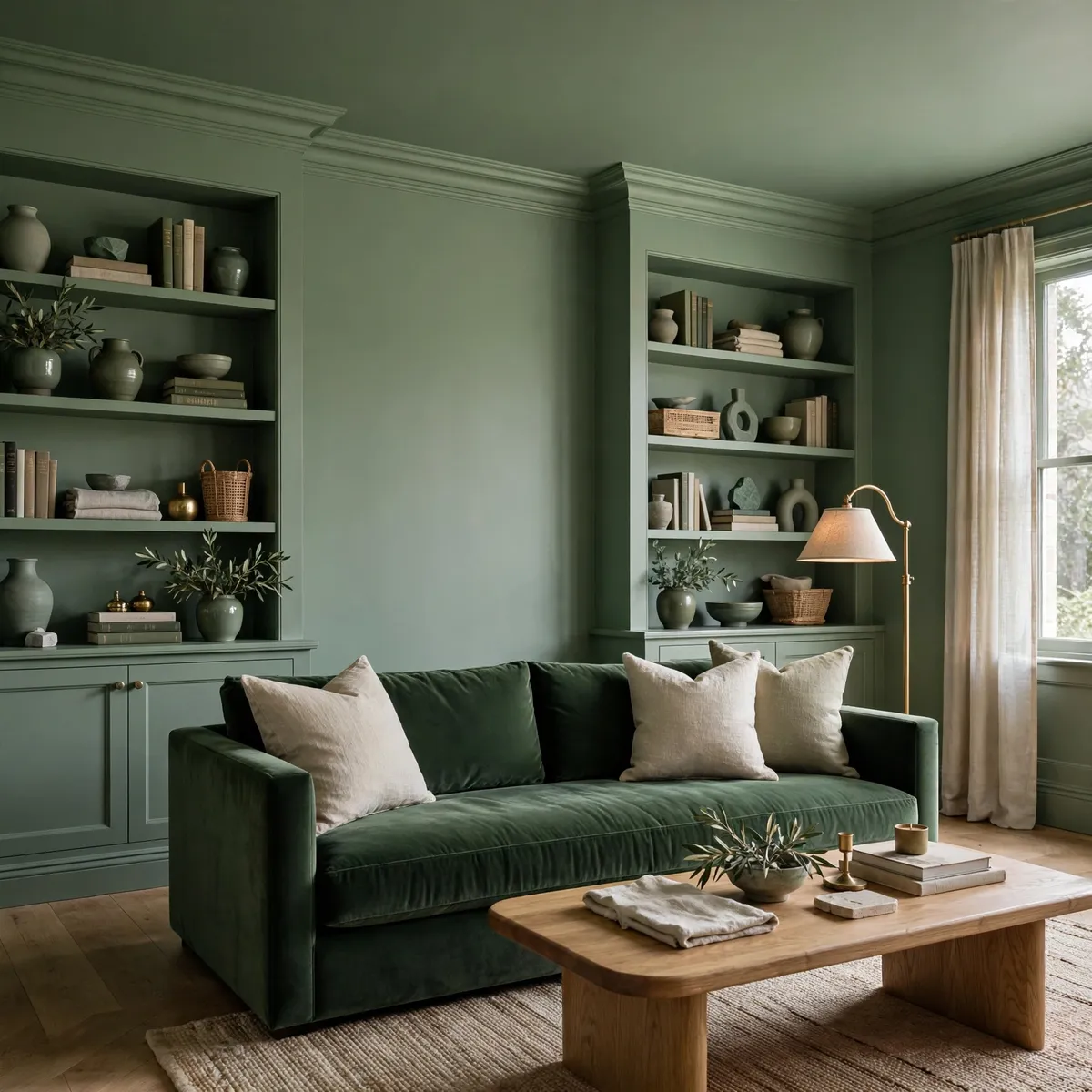
Color drenching does the opposite: it treats the room as one continuous volume. Walls, ceiling, skirting boards, door and window trim, and often built-in shelving or a fireplace surround all take the same color. Because there is no pale ceiling or white trim breaking the field, the boundaries of the room soften, and the space feels wrapped rather than divided.
That softening effect is the part most people get wrong before they try it. A drenched room does not automatically look smaller. White trim and a white ceiling chop a room into visible edges; removing those edges blurs where one surface ends and another begins, which can make a small room feel more expansive, or at least more settled and cocooning.
The risk is not size — it is flatness. A single color in a single flat finish under a single overhead light will look dull. The fix, covered in detail below, is variation inside the color: matte walls against satin trim, velvet against linen, warm light at several heights, and natural wood to ground it all.
- Accent wall: one bold plane, the rest of the room stays light. Best when you want a focal point and little commitment.
- Color drenching: every architectural surface in one color. Best when you want a room to feel immersive, calm, and deliberately designed.
- Double drenching: a close cousin where walls and ceiling take one color and the furniture and textiles take a second, closely related tone. Useful if full single-color drenching feels like too much.
Quick tips
- Start with a room that already has a clear purpose — a bedroom, a reading nook, a powder room — rather than an open-plan space where the color has nowhere to stop.
- If you are unsure, drench a small room first. Small rooms are cheaper to repaint and the cocooning effect flatters them most.
- Keep the color muted and complex: colors with a little grey, brown, or earthiness in them are far more forgiving than clean, bright hues.
How to Choose a Color for Color Drenching
Choosing a drenching color is less about finding a favorite swatch and more about finding a color you can live inside. A shade that looks charming on a two-inch chip can feel relentless across four walls, a ceiling, and a door.
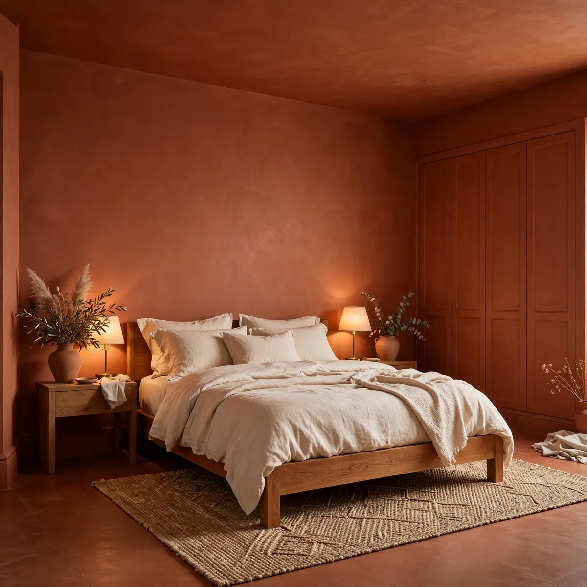
So the selection process should favor depth over brightness. Look for colors described as muted, earthy, smoky, or complex — deep sage and olive greens, warm terracotta and clay, midnight navy, chocolate brown, muted plum or burgundy, and warm beige or sand. These colors have enough undertone to shift gently through the day as the light changes, which keeps the room from feeling static.
Then test the color against the room itself, not against your memory of the paint store. North-facing rooms get cool, bluish light that makes warm colors look more balanced and cool colors look colder, while south-facing rooms flood the space with warm light that deepens earthy tones and can make a bright color feel loud.
The room’s fixed elements matter too: the tone of the flooring, the color of any stone or tile, and how much natural wood is present. A terracotta that sings against oak floors can clash with grey-toned tile, and a navy that looks rich beside walnut can feel cold beside pale ash. If the room has strong fixed finishes, let them narrow the field before you fall in love with a swatch.
- Shortlist three colors that suit the room’s light and fixed finishes, not just your taste in the abstract.
- Paint large test swatches — at least a square foot each — on two walls, including one that catches the main light source.
- Live with them for two or three days, checking morning, midday, and evening light, plus lamplight.
- Pick the color that still pleases you at its worst moment of the day, not just at its best.
Quick tips
- Avoid clean brights and near-neons for full drenching; they tire the eye and show every imperfection in the plaster.
- If you love a bold color, choose its muted, greyed-down version for the walls and let the bolder version appear in a cushion or a piece of art.
- When in doubt between two shades, choose the deeper one for small rooms and the softer one for large, bright rooms.
Color Drenching Ideas for Bedrooms
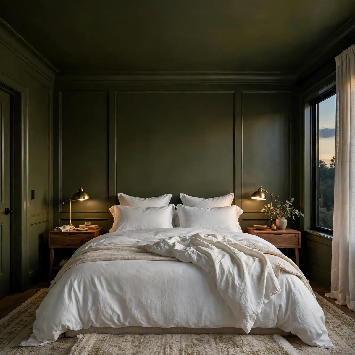
The bedroom is the easiest place to start color drenching, and the room where the payoff is most immediate, because a bedroom is meant to feel restful and enclosed. A deep sage, a warm clay, a chocolate brown, or a muted plum wrapped across walls, ceiling, and trim turns the room into a quiet backdrop for sleep, and it makes ordinary bedding look deliberate.
White bedding against a drenched wall reads crisp and hotel-like; tonal bedding in a shade close to the wall color reads softer and more cocooning. Either approach works — the mistake is mixing too many unrelated accent colors that fight the envelope you just built.
Bedrooms also reward one small piece of discipline: let the biggest surfaces carry the color, and let the bed itself provide the contrast or the harmony. A wooden headboard or a linen-upholstered headboard in a natural tone breaks up the color field just enough to give the eye somewhere to rest.
Nightstands in warm wood, brass or bronze reading lamps, and a rug in a quiet neutral keep the room from feeling like a single block of paint. If the bedroom is small, drenching often helps rather than hurts, because the unbroken color erases the visual clutter of mismatched trim and makes the room feel like one calm space instead of a box of edges.
Quick tips
- Paint the wardrobe doors and any built-in cabinetry the same color so storage disappears into the walls.
- Use warm, dimmable bedside lighting — cool white bulbs will flatten a drenched bedroom.
- Keep artwork minimal and tonal; a single large piece in colors close to the wall reads better than a gallery wall of contrasts.
Color Drenching Ideas for Living Rooms
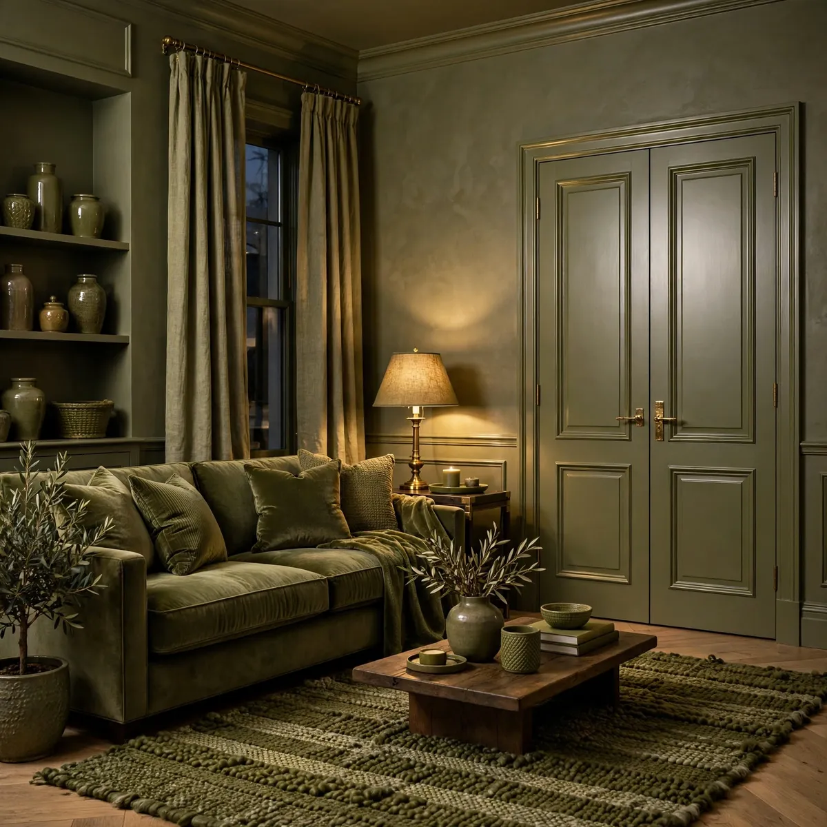
A drenched living room is a statement, so it helps to think of it as a mood rather than a color: do you want the room to feel like a leafy retreat, a warm clay-toned gathering space, or a moody evening room? Deep sage and olive greens suit living rooms that get good daylight and have natural wood or leather in them. Warm terracotta suits rooms where people gather in the evening, because it glows under lamplight.
Midnight navy suits rooms used mostly after dark, where a cocooning, cinema-like feel is the point. The right choice depends as much on how the room is used as on how it looks at noon, and understanding living room color psychology is a useful way to check that the mood you are painting matches the mood you want the room to have.
Because living rooms usually contain the most furniture, they are also the rooms where tonal layering matters most. A sofa in the same color family as the walls — deeper or softer, in velvet or a textured weave — will look intentional rather than matched.
Cushions and throws in two or three neighboring shades add depth without breaking the envelope. Wood is the great stabilizer here: an oak or walnut coffee table, a wooden sideboard, or exposed timber shelving stops a drenched living room from feeling like a showroom and makes it feel lived in. Metal finishes should be kept consistent — brass or bronze reads warm against almost every drenching color, while chrome can feel cold against earthy tones.
Quick tips
- Let at least one large piece of furniture sit a shade or two away from the wall color so the room has depth.
- Use natural materials — wood, linen, wool, leather — to keep a single-color room feeling tactile rather than painted.
- Keep the rug tonal rather than patterned in a contrasting palette; a quiet rug lets the drenching do the talking.
Color Drenching Ideas for Dining Rooms
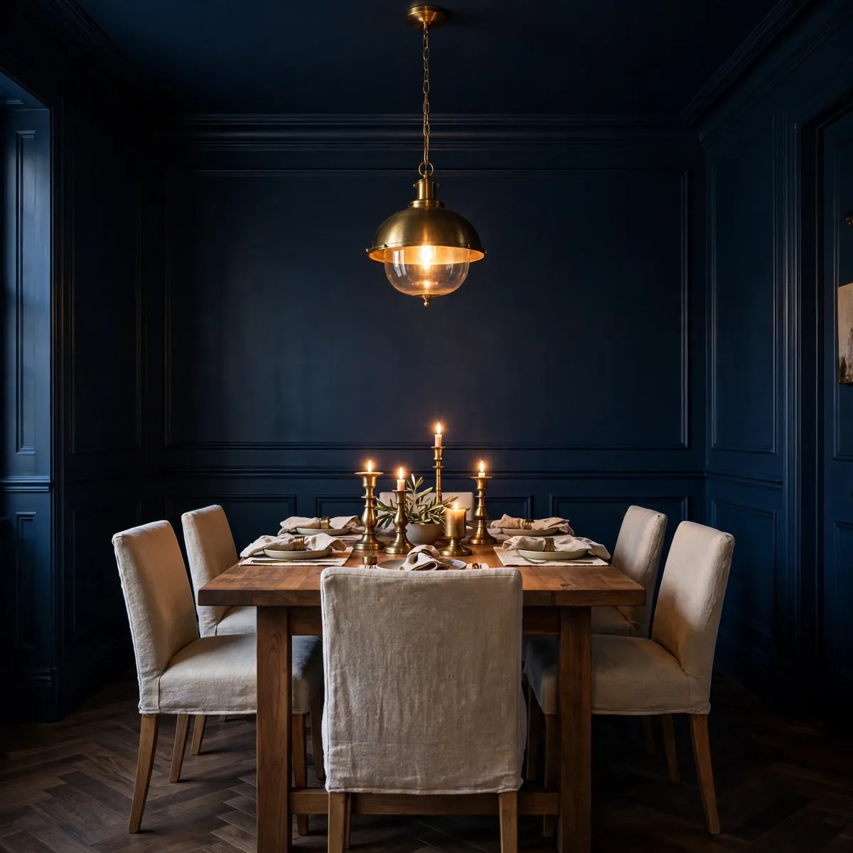
Dining rooms are made for color drenching. They are used in focused bursts, usually in the evening, and they benefit from a sense of occasion that a single enveloping color delivers almost automatically.
Midnight navy, deep burgundy, chocolate brown, or a rich olive all make a dining room feel like a restaurant booth in the best sense — intimate, flattering, and a little dramatic. Because dining rooms are rarely flooded with daylight in the evening, the color reads richer and deeper than it would in a sunlit kitchen, which means you can go a shade bolder here than in the rest of the house.
The details that elevate a drenched dining room are light and tableware. A pendant or chandelier on a dimmer, plus candlelight, lets the color shift from lively at the start of a meal to soft by the end of it.
Table linens in cream, natural linen, or a tone close to the wall color keep the table from visually shouting, while brass or bronze candle holders and serving pieces catch the light and give the room sparkle without introducing a second color story. Chairs in a tonal fabric or in wood keep the envelope intact; avoid introducing a contrasting upholstery color that chops the room back into pieces.
Quick tips
- Put the dining light on a dimmer — drenched dining rooms live or die by evening lighting.
- Choose table linens in cream, natural linen, or a tone close to the wall color.
- Use candles and brass accents for sparkle; they warm up every drenching color.
Color Drenching Ideas for Home Offices
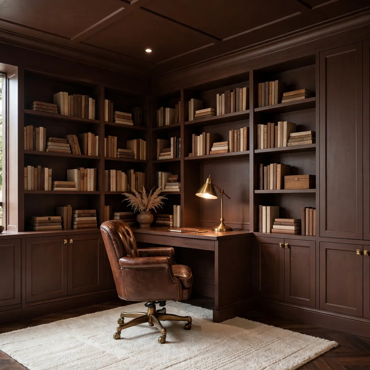
A home office is one of the most practical rooms to drench, because the goal is focus, and a single enveloping color removes visual noise. Deep green is the classic choice for a study-like feel, navy suits video calls because it reads clean and composed on camera, and chocolate brown gives a library-like warmth that makes long working days feel less clinical.
What matters most in an office is that the color supports concentration rather than competing with the screen. Muted, mid-to-deep tones do that; bright or highly saturated colors pull the eye away from work.
Built-ins are the office’s secret advantage. Shelving, a desk wall, and cabinetry painted the same color as the walls make storage fade into the background, so the room feels calmer and larger than the same room with white shelving breaking up a colored wall.
Keep the desk surface in wood or a light stone so the working plane reads clearly, and choose task lighting carefully — a warm desk lamp plus a soft overhead light prevents the deep color from making the room feel dim during the working day. A rug in a neighboring tone and a single plant add life without breaking the envelope.
Quick tips
- Paint built-in shelving and the desk wall the same color so storage visually disappears.
- Keep the desk surface in wood or light stone so the work area stays legible.
- Test how the color reads on video calls before committing — navy and deep green are usually the most flattering.
Color Drenching Ideas for Bathrooms and Powder Rooms
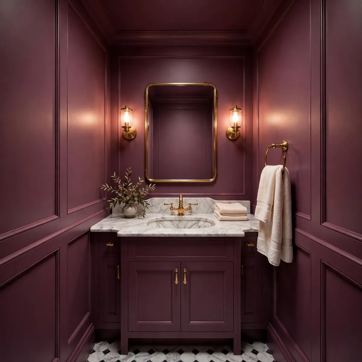
Powder rooms are the lowest-risk, highest-reward rooms for color drenching. They are small, they are used briefly, and guests remember them, so a bold-but-muted color — muted plum, deep green, midnight navy, or chocolate — feels like a deliberate jewel box rather than a commitment.
Full bathrooms can be drenched too, but they need more care: moisture, tile, and mirrors complicate the paint story, so the safest approach is to drench the painted surfaces (walls, ceiling, trim, vanity) and let tile act as a tonal partner rather than forcing every surface into the same color.
In a bathroom, the finish matters as much as the color. Use a moisture-appropriate paint — typically a satin or a specialist bathroom finish on walls, with the ceiling in the same color but in a formulation suited to humidity.
Brass or bronze fixtures warm up almost every drenching color and age more gracefully than chrome in a deeply colored room. Mirrors are your best friend here: a large mirror bounces light around a drenched bathroom and keeps it from feeling dark, and a mirror with a thin brass or wood frame reads as part of the design rather than an interruption. Cream or white towels provide a small, clean contrast that keeps the room feeling fresh.
Quick tips
- In a powder room, go bolder — small rooms carry deep color best and are cheap to repaint if you change your mind.
- In a full bathroom, use moisture-rated paint and let tile be a tonal partner, not an exact match.
- Use a large mirror and warm metallic fixtures to keep a drenched bathroom bright and inviting.
Color Drenching Ideas for Kitchens
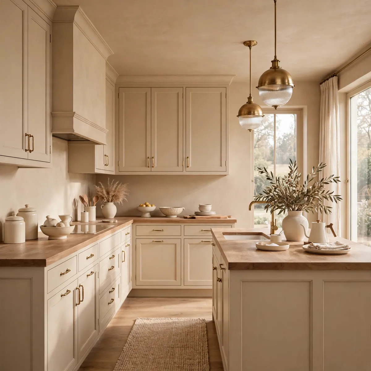
Kitchens are the bravest place to drench, and the place where restraint pays off most. A full drench in a kitchen means walls, ceiling, trim, and cabinetry in one color — warm beige or sand, deep sage, or a muted clay are the most livable choices, because kitchens are used all day and a very dark kitchen can feel heavy by breakfast.
The reward for the commitment is a kitchen that looks custom-built rather than assembled: cabinetry that matches the walls reads as architecture, not as boxes screwed onto a wall.
If a full kitchen drench feels like too much, the middle path works well: drench the cabinetry, trim, and one wall in the chosen color, keep the ceiling a soft warm white, and let the worktops and splashback sit in a neighboring neutral.
Natural materials carry a drenched kitchen — wood worktops, a stone splashback in a tonal shade, cream ceramics, and brass handles all add warmth and texture without introducing a competing color. Open shelving painted the same color as the walls keeps display items feeling curated rather than cluttered, and a single warm pendant light over an island anchors the scheme.
Quick tips
- Warm beige, sand, deep sage, and muted clay are the most livable kitchen drenching colors for all-day use.
- If full drenching feels too much, drench cabinetry, trim, and one wall, and keep the ceiling soft warm white.
- Use wood worktops, tonal stone, and brass handles to add warmth without adding a second color story.
Finishes, Texture Layering, and the Ceiling
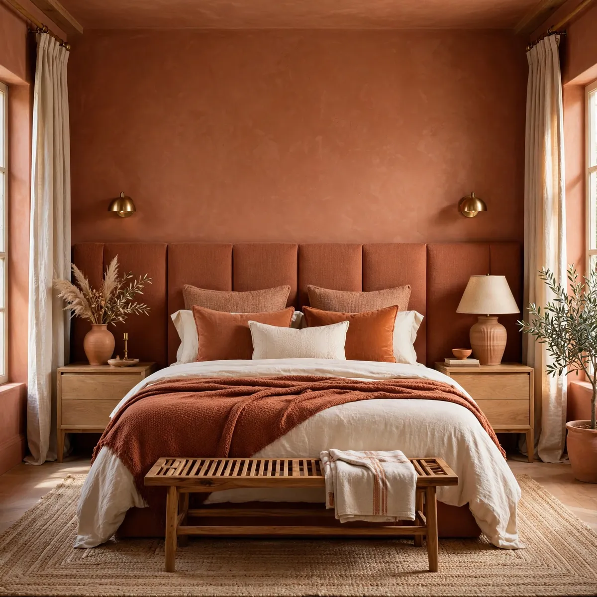
This is the section that decides whether color drenching looks luxurious or flat. The rule is simple: same color family, different finishes and textures. Walls in a matte or flat finish absorb light and read soft and velvety.
Trim, doors, and skirting in a satin or eggshell finish catch the light differently, so the architecture of the room stays legible even though everything is one color. Built-in shelving in a satin finish, a velvet sofa, linen curtains, a wool rug, and a wood table all sit inside the same color story while feeling completely different to the eye and the hand. That variation is what makes a single-color room feel rich instead of monotonous.
The ceiling deserves its own decision, because it is the largest single surface in the room and the one people most often leave white out of habit. Painting the ceiling the same color is what makes drenching feel truly immersive — it removes the last visual break and makes the room feel wrapped.
In rooms with low ceilings, a drenched ceiling in a matte finish usually feels better than a white one, because the white ceiling draws the eye to exactly how low it is. The one exception is a room that is already dark and gets very little natural light: there, a ceiling one shade lighter than the walls, in the same color family, keeps the envelope while letting a little more light bounce around.
- Walls: matte or flat finish for a soft, light-absorbing field.
- Trim, doors, skirting, built-ins: satin or eggshell so the architecture catches the light.
- Ceiling: same color in a matte finish for full immersion; one shade lighter in very dark rooms.
- Textiles and furniture: velvet, linen, wool, leather, and wood in neighboring shades for tactile depth.
Quick tips
- If the room looks flat, add texture before adding color — a velvet cushion, a wool throw, or a wood surface will fix it faster than a new paint shade.
- Keep all finishes within the same color family; a contrasting finish in a different hue breaks the drench.
- Paint a test patch of ceiling as well as wall — ceilings read darker than walls in the same paint.
Lighting, Furniture, and Textiles in Tone
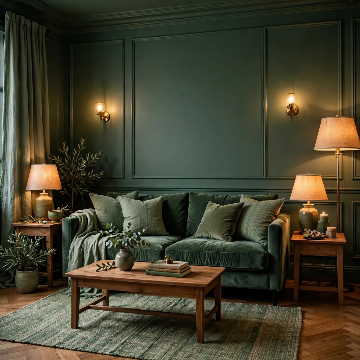
Lighting is the single most underestimated part of color drenching. A deeply colored room lit by one cold overhead light will look flat and gloomy, while the same room lit by several warm sources at different heights will look layered and inviting.
The practical formula is three layers: ambient light from a dimmable overhead or a few ceiling sources, task light from table and floor lamps where people actually sit and read, and accent light from sconces, picture lights, or a lamp inside a shelving unit. Warm bulbs — around 2700K — flatter earthy and muted colors; cool white bulbs fight them. Dimmers matter more here than in any other decorating scheme, because they let the same room feel bright for daytime use and cocooning in the evening.
Furniture and textiles should stay inside the color story, but not on top of it. The most reliable approach is to let large upholstered pieces sit one or two shades away from the wall color, in a fabric with visible texture — velvet, boucle, heavy linen — so they read as part of the room rather than as a matching set.
Cushions and throws in two or three neighboring shades add the tonal movement that keeps the eye interested. Wood is the anchor that stops a drenched room from feeling like a paint sample: oak, walnut, and other warm woods sit naturally beside sage, terracotta, navy, plum, and chocolate alike. Metal finishes should stay consistent throughout the room — brass or bronze for warmth, blackened metal for a more contemporary edge.
Quick tips
- Use three layers of warm light — overhead, task, and accent — all on dimmers where possible.
- Choose bulbs around 2700K; cool white light flattens muted, earthy colors.
- Let large furniture sit one or two shades from the wall color, in textured fabrics, and anchor the room with warm wood.
Small Rooms and the Renter-Friendly Version
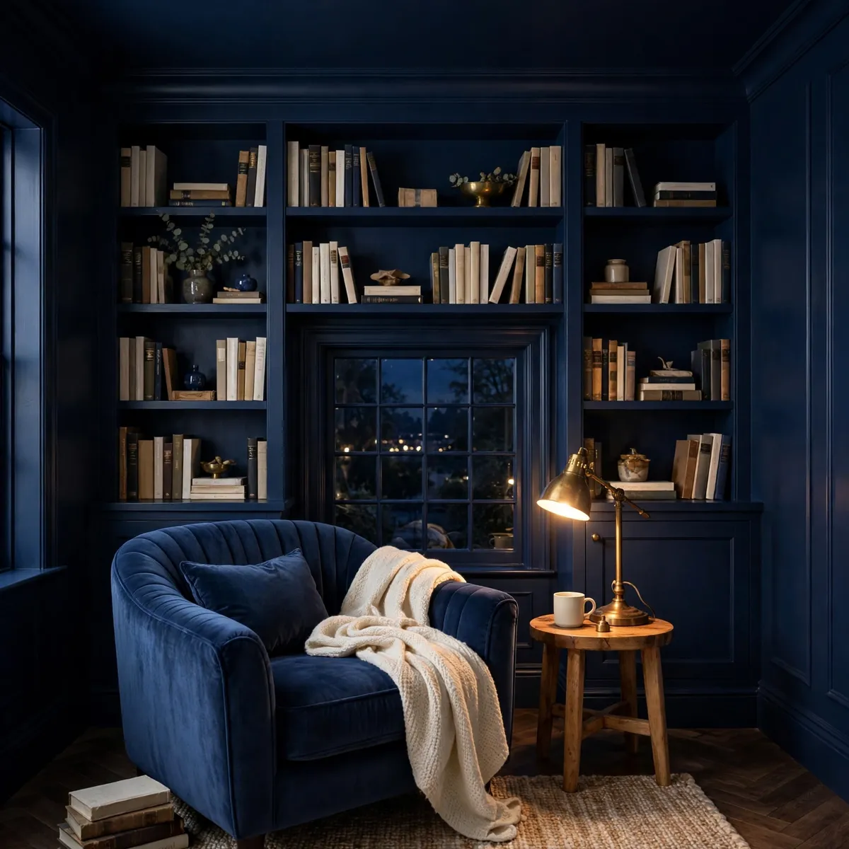
Small rooms are where color drenching earns its reputation, because the usual advice — keep small rooms white — ignores how choppy a small white room can feel. When trim, doors, and ceiling all disappear into one color, the eye stops counting edges and the room reads as one calm volume.
A reading nook, a box room, a hallway, a home office under the stairs, or a powder room are all ideal starting points. Keep the furniture low and tonal, use a mirror to bounce light, and let one warm lamp do the evening work. The result is a small room that feels like a destination rather than a leftover.
Renters, or anyone not ready to repaint a whole room, can get most of the effect without touching the walls permanently. Large tonal curtains, a slipcovered sofa and matching cushions in the chosen color family, a big tonal rug, and painted or peel-and-stick panels on a single wall can build a convincing color envelope.
Removable wallpaper in a muted tone, a painted bookcase, and a headboard in the same color family all push the room toward drenching without a landlord dispute. The principle stays the same: reduce the number of competing colors and finishes until the room reads as one intentional field, even if the underlying walls are still rental white.
Quick tips
- Start with the smallest room you love using — a nook, a powder room, or a box bedroom — before committing to a large space.
- In small rooms, keep furniture low and tonal, and use a mirror to bounce light around the envelope.
- Renters: build the envelope with curtains, slipcovers, a tonal rug, and painted or removable panels rather than repainting.
Mistakes to Avoid and How to Test Paint First
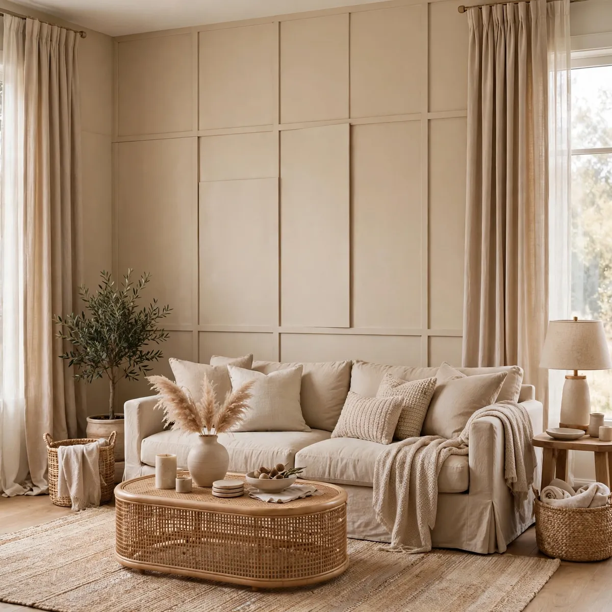
Most color drenching failures come from a short list of avoidable mistakes. The first is choosing a color that is too bright or too clean; saturated brights tire the eye and expose every flaw in the plaster, while muted, complex colors forgive both.
The second is painting everything in one flat finish, which turns the room into a single dull plane — vary the finish between walls, trim, and built-ins. The third is lighting the room with a single cold overhead light; warm, layered light with dimmers is not optional in a drenched room, it is the mechanism that makes the color look good. The fourth is introducing too many accent colors once the envelope is built — a red cushion here, a blue vase there — which chops the room back into the visual clutter drenching was meant to remove.
Testing properly prevents almost all of it. Buy sample pots of your top three colors and paint large swatches — at least a square foot each, ideally two feet — on two walls of the actual room, including one wall that catches the main light. Check them in morning, midday, and evening light, and again under lamplight, for at least two full days.
Paint a swatch on the ceiling too, because ceilings read darker than walls in the same paint. If you are drenching trim and built-ins, test the satin finish alongside the matte wall finish so you can see how the two finishes interact. The color that still pleases you on a dull evening, under artificial light, is the right one — not the one that looked best in the paint store at noon.
- Shortlist three muted, complex colors suited to the room’s light and fixed finishes.
- Paint large swatches on two walls and on the ceiling; live with them for at least two days.
- Check morning, midday, evening, and lamplight before deciding.
- Test the satin trim finish next to the matte wall finish so the contrast reads correctly.
- Only then commit to the full room — and keep the swatch card for touch-ups.
Quick tips
- Never choose a drenching color from a chip alone — always test large swatches in the real room.
- Do not mix in unrelated accent colors once the envelope is built; keep accents inside the same color family.
- Keep one spare pot of the exact paint and finish for touch-ups; drenched rooms show scuffs more than white rooms do.
Frequently Asked Questions
What is color drenching?
Color drenching is painting the walls, ceiling, trim, and often the built-ins and furniture of a room in one saturated color, so the space reads as a single immersive envelope instead of a set of separate surfaces. It differs from an accent wall, which paints only one wall bold and leaves the rest light.
What colors work best for color drenching?
Muted, complex, earthy colors work best: deep sage or olive green, warm terracotta or clay, midnight navy, chocolate brown, muted plum or burgundy, and warm beige or sand. Avoid clean brights and near-neons, which tire the eye and show every wall imperfection.
Does color drenching make a room look smaller?
Not automatically. Because drenching removes the contrasting edges of white trim and ceilings, it blurs the room’s boundaries, which can make a small room feel more expansive — or at least more settled and cocooning. The result depends on light and texture: warm layered lighting and varied finishes inside the color family keep the room from feeling closed in.
How do I start color drenching without painting everything?
Start with one small room, such as a bedroom, reading nook, or powder room, and test large paint swatches first. For a low-commitment version, build the envelope with tonal curtains, slipcovers, a matching rug, and painted or removable panels, keeping everything inside one color family.
Conclusion
Color drenching is not about being brave with paint for its own sake. It is about giving a room one clear, calm identity — walls, ceiling, and trim working together instead of competing. Choose a muted, complex color that suits the room’s light, vary the finishes and textures inside that one color family, light the room warmly at several heights, and test properly before you commit. Start small, with a bedroom, a nook, or a powder room, and you will quickly see whether the cocooning effect suits how you live. If it does, the rest of the house tends to follow.