20 Stunning Colorful Kitchen Ideas That Belong in a Magazine ♥ [Vivid & Vogue]
Why Colorful Kitchen Ideas Are the New Neutral
Color is an emotional language — it changes how a room feels before you even notice what changed. And right now, kitchens are becoming the most expressive rooms in the house. The best colorful kitchen ideas are not about chaos; they are about balance: vibrant tones grounded by calm neutrals, and texture that keeps every color feeling rich instead of flat.
Here is the definition worth holding onto: a magazine-worthy colorful kitchen is not the one with the most color — it is the one where every color has a job. Start small if you need to — a statement backsplash, one bold cabinet hue, a shelf of hand-painted dishware — and build from there. Do not fear contrast; contrast is what gives rooms character. These 20 colorful kitchen ideas show how to layer color like a stylist, so the result feels joyful, polished, and perfectly you.
1. Let Retro Tiles Steal the Show
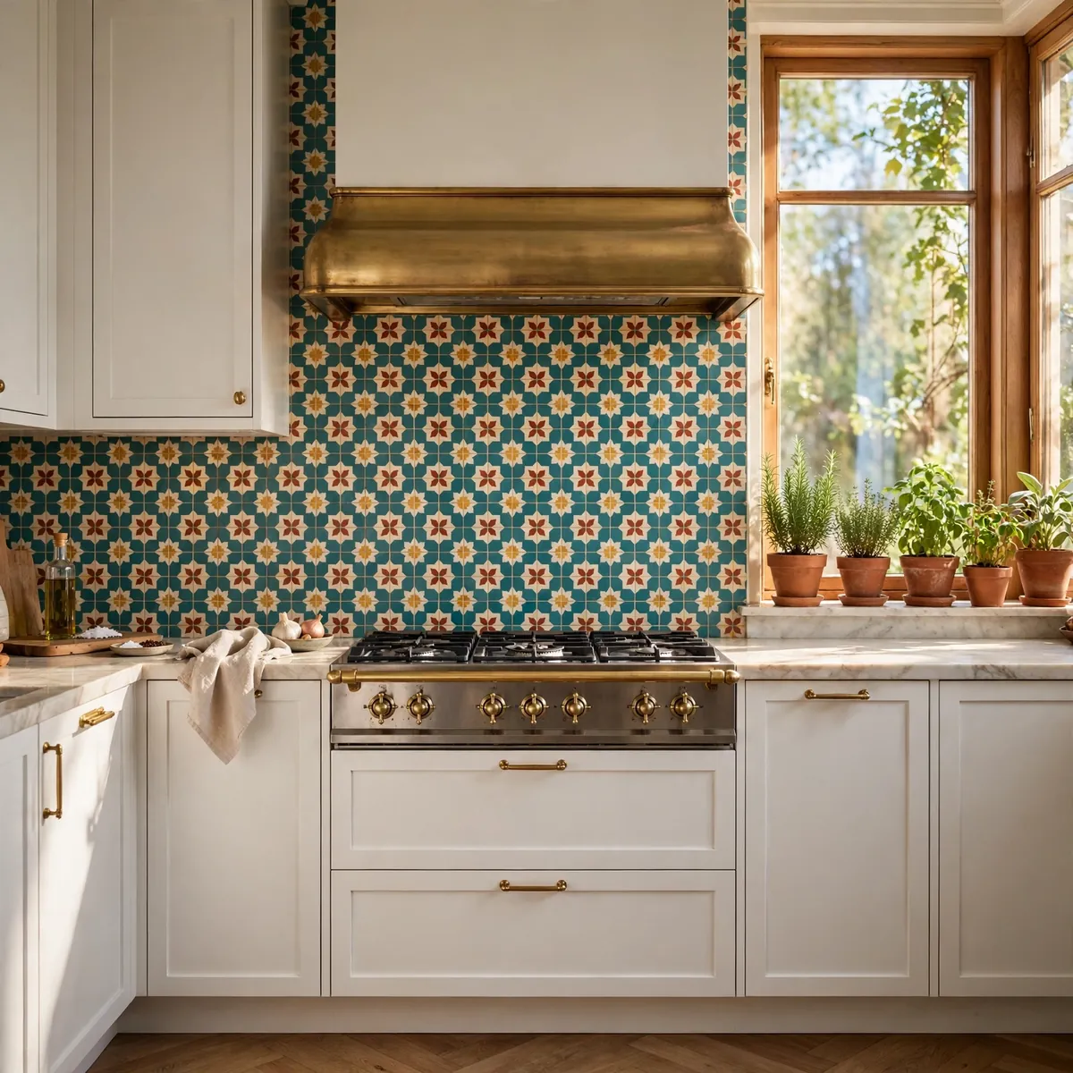
Retro tiles in teal, mustard, red, and cream are the fastest way to make a kitchen look styled rather than simply finished — one of the most reliable colorful kitchen ideas for instant magazine energy. Let the tile do the talking and keep the cabinets quiet — flat white or warm wood fronts disappear so the pattern can shine. Gold or unlacquered brass fixtures add a glamorous edge, and terracotta pots with fresh herbs on the sill bring the palette down to earth.
Quick tips
- Repeat the tile’s colors in small doses — a kettle, a runner, a framed print.
- Alternate tile colors in one consistent rhythm so the pattern reads cohesive, not random.
- Grout in a warm off-white keeps retro tile feeling vintage, not dated.
2. Ground Green Tiles With Citrus Joy

Emerald green subway tile is a power move because it is both saturated and grounded — it behaves like a neutral while delivering all the drama of color, which is exactly why stylists reach for it when a kitchen needs personality without risk. Against that deep green backdrop, citrus accents — a tangerine kettle, blush-pink ceramics, a lemon-yellow runner — look electric, because complementary colors like pink and green make each other pop harder than either could alone. Warm wood countertops keep the whole thing from feeling cold or precious, adding the honeyed warmth that lets bold color feel livable rather than showroom-styled. The secret is organized chaos: keep the base solid and architectural (the tile run, the counter, the cabinet fronts), then layer small bright accessories freely — vintage jars, colored glassware, a stack of patterned plates. Because nothing structural is fighting, the room stays calm while the details dance; and when your mood shifts, the accessories are the cheapest thing in the room to swap.
Quick tips
- Keep big surfaces (counters, floors) warm and neutral so the color has a stage.
- Group citrus accents in odd numbers — threes photograph best.
3. Pair Hot Pink With Sunshine Yellow

Pink reads playful, yellow reads optimistic — together they are pure dopamine. The trick to making this power combo look editorial instead of exhausting is color zoning: break up the saturation with a crisp white backsplash, geometric flooring in black and white, and minimal hardware so nothing competes. It is one of those colorful kitchen ideas that works best in rooms with strong natural light, where the brights glow instead of glare. Warm brights always need a neutral floor to stabilize them — pale oak or simple white tile lets the color float.
Quick tips
- Anchor the combo with one dominant color; let the second appear in smaller doses.
- Keep upper cabinets light so the room never feels top-heavy.
4. Go Moody With Navy and Jungle Green

Deep navy cabinets plus natural wood and trailing greenery is color for people who do not do pastels — and one of the most sophisticated colorful kitchen ideas in this list. The darkness reads luxurious and grounded, while plants add life and movement that keep it from feeling heavy. Repeat the deep hue across trim, a painted pantry door, or even the window frames — repetition is what makes dark color look intentional. Brass or bronze fixtures reflect light and warm the whole composition.
Quick tips
- Sample dark colors in evening light; they shift dramatically.
- Balance one dark run of cabinets with lighter stone counters.
5. Play House With Pastels, But Keep It Modern
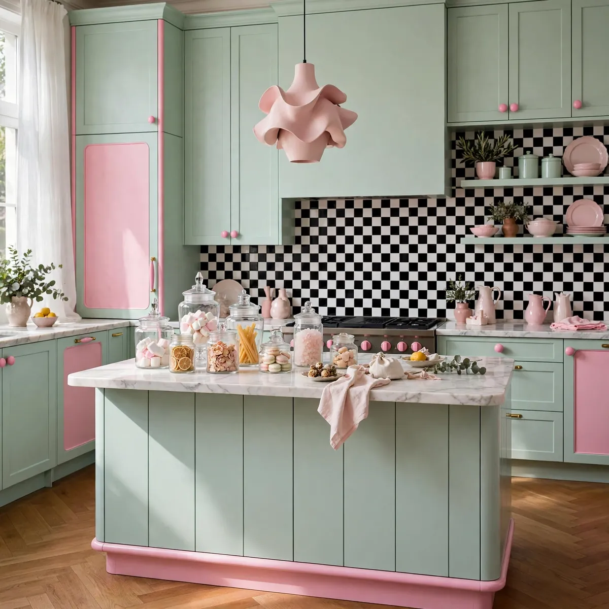
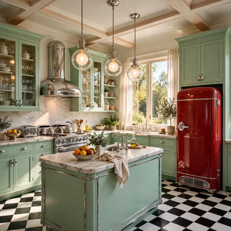
Mint green plus bubblegum pink is the pastel playhouse — sweet, but it needs structure to stay grown-up. A black-and-white checkered backsplash adds graphic discipline, while simple modern shapes (a slab-front island, a single sculptural light) keep it from tipping into costume. Among colorful kitchen ideas, the pastel playhouse works when you choose one dominant pastel and one accent, and let everything else stay quiet. A few playful pieces — vintage jars, patterned cake stands — add personality without clutter.
Quick tips
- One dominant pastel plus one accent is the whole formula.
- Checkered or striped patterns give pastels the backbone they need.
6. Block Coral Against Red Tile

Color blocking is a stylist’s shortcut: paint the cabinets warm coral and run a red hexagonal tile backsplash, and the two warm tones soften each other into a modern Mediterranean mood. Balance the warmth with temperature contrast — blue hexagon flooring or a dusty-blue runner — so the room never overheats. Terracotta planters and potted herbs add depth and keep the look sunbaked rather than sweet.
Quick tips
- Keep warm-blocked kitchens anchored with one cool tone (blue floor, steel appliances).
- Hexagon and zellige tiles love color blocking; their shapes add texture for free.
7. Stripe the Walls, Pop the Lemon

Pink-and-white striped walls with bold yellow stools and pendants is dopamine décor at full volume — and these colorful kitchen ideas work because the background pattern is clean and rhythmic while the color arrives in controlled pops. A pastel-blue retro fridge adds a cool counterpoint that keeps the pinks and yellows from merging into one warm blur. The stylist’s rule here is tone repetition: every shade in the room should appear at least twice, in small doses, so nothing feels random.
Quick tips
- Stripes go on one or two walls maximum — never all four.
- Repeat each accent color at least twice so the room feels composed.
8. Charm It With Sage and Floral Tile

Sage green cabinets plus a hand-painted floral tile backsplash is cottagecore with a design degree — and colorful kitchen ideas like this one prove softness can still be bold. Muted greens and warm woods calm the mind — there is real biophilic psychology behind why this combination lowers stress — while the small-scale patterned tile adds the artisanal detail that makes a kitchen feel collected. Unlacquered brass fixtures complete the story with a soft, lived-in gleam.
Quick tips
- Keep floral tile to the backsplash; let cabinets and counters stay solid.
- Muted greens age beautifully — they rarely look dated.
9. Pair Violet Cabinets With Abstract Tile
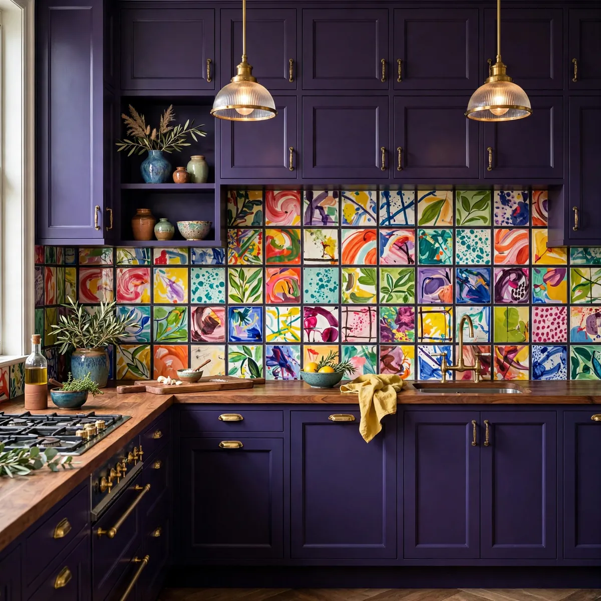
Deep violet cabinetry is a bold, confident base — and it becomes editorial when paired with a hand-painted abstract tile backsplash in contrasting brights. This is controlled chaos: the dark, structured cabinet lines ground the room while the free-form tile adds expression. These colorful kitchen ideas prove that tension is a style — mix structured lines with free-form elements deliberately, and let a warm wood countertop sit between the two like a mediator, keeping the whole composition balanced.
Quick tips
- Let the tile’s brightest color appear once more elsewhere — a vase, a stool.
- Wood counters warm up cool purples and violets.
10. Glow Pink Tile Against White Cabinets

A glossy pink herringbone backsplash against crisp white cabinets is how you do pink for grown-ups. The trick is tone layering: use subtle shifts in pink intensity across the tile run so the surface has depth instead of flatness. White cabinets keep the whole thing bright and clean, while metallic accents and transparent glassware add sparkle without competing for attention.
Quick tips
- Glossy tile bounces light — ideal for darker kitchens.
- Keep open-shelf styling tonal: white, blush, clear glass.
11. Drench One Wall in a Single Bold Color

Color drenching — painting one wall (and its trim, and maybe the door) in a single saturated hue — is the lowest-cost, highest-impact of all colorful kitchen ideas. A terracotta, ochre, or deep teal wall turns a plain galley into a room with a point of view, and because it is just paint, it is fully reversible. Keep the cabinets and counters calm so the drenched wall gets all the attention.
Quick tips
- Paint the trim the same color for a truly drenched, seamless look.
- One drenched wall is plenty; the rest should breathe.
12. Split Upper and Lower Cabinets in Playful Hues

Two-tone cabinets are already a classic — now make them playful with two-tone colorful kitchen ideas like these: buttery yellow lowers with soft white uppers, or coral lowers with pale aqua uppers. Keeping the lighter color on top preserves airiness while the bolder color grounds the room. The palette stays tight (two hues from the same family or a complementary pair), so it reads intentional rather than indecisive.
Quick tips
- Test the pairing on cabinet doors in your own light before committing.
- Keep hardware consistent across both tones to unify the look.
13. Make the Range Your Color Statement
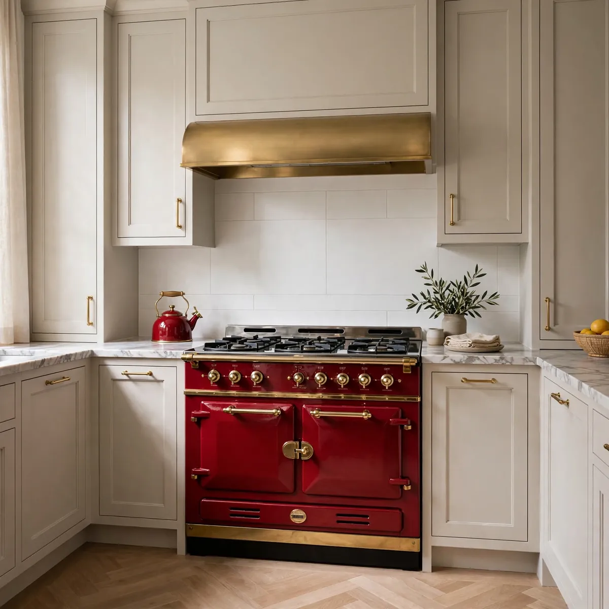
A colorful range — cherry red, mint, butter yellow, deep blue — is a single purchase that transforms the whole kitchen. Treat it like art: keep surrounding cabinets quiet and let the appliance be the room’s exclamation point. This is one of the most renter-proof colorful kitchen ideas too, since a freestanding range moves with you when you do.
Quick tips
- Match one small accessory to the range color for cohesion.
- Keep the backsplash simple so the range stays the star.
14. Paint the Ceiling a Surprise Color
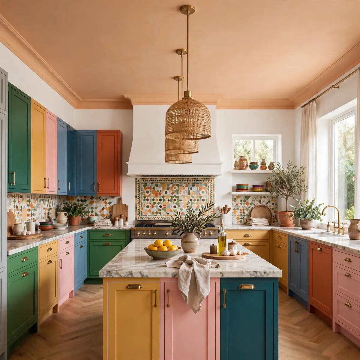
The ceiling is the fifth wall, and a wash of color overhead — soft apricot, pale sky blue, buttery yellow — makes a kitchen feel wrapped and intentional. It works especially well in rooms with white walls and colorful cabinets, where the ceiling color ties everything together. Keep it one or two tones lighter than your boldest cabinet color so it glows rather than looms.
Quick tips
- Flat paint hides ceiling imperfections best.
- Extend the color onto crown molding for a finished look.
15. Style Open Shelves Like a Color Story

Open shelves are a zero-renovation canvas for color: group dishware, glassware, and cookbooks by hue and the shelf becomes art. Start with a base of white ceramics, then add two accent colors in repeating doses — amber glass, cobalt bowls, green plants. Because shelves restyle in minutes, this is the easiest of the colorful kitchen ideas to evolve with the seasons.
- Start with white ceramics as the calm base.
- Add two accent colors, repeated at least three times each.
- Leave breathing room — packed shelves read as clutter, not color.
Quick tips
- Swap shelf styling seasonally for a kitchen that always feels fresh.
- Odd-numbered groupings photograph best.
16. Paint Just the Island the Boldest Color
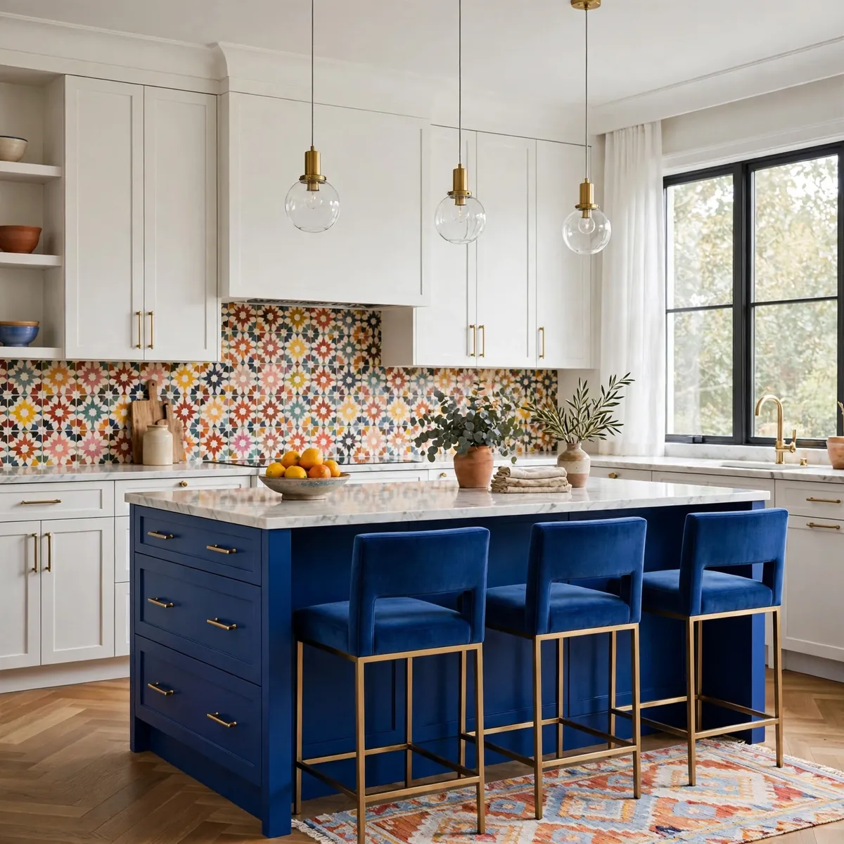
If full-color cabinets feel like too much, paint only the island. A cobalt, emerald, or tangerine island against neutral perimeter cabinets delivers the magazine moment with a fraction of the commitment. It is the same discipline behind great minimalist kitchen ideas — one confident move, everything else calm — except here the move is gloriously loud.
Quick tips
- Echo the island color in barstools or pendant cords.
- Keep island lighting simple; the color is the decoration.
17. Wrap the Room in Warm Terracotta

Terracotta is color that behaves like a neutral: warm, earthy, endlessly combinable. Wash the cabinets, a limewash wall, or even the floor in terracotta tones and the kitchen glows like late-afternoon sun. It is one of the warmest colorful kitchen ideas for open-plan spaces, pairing with creamy whites, natural wood, and black accents for a look that feels Mediterranean and timeless rather than trendy.
Quick tips
- Limewash or matte finishes suit terracotta’s earthy character.
- Black hardware gives terracotta a crisp, modern edge.
18. Build a Jewel-Toned Breakfast Nook
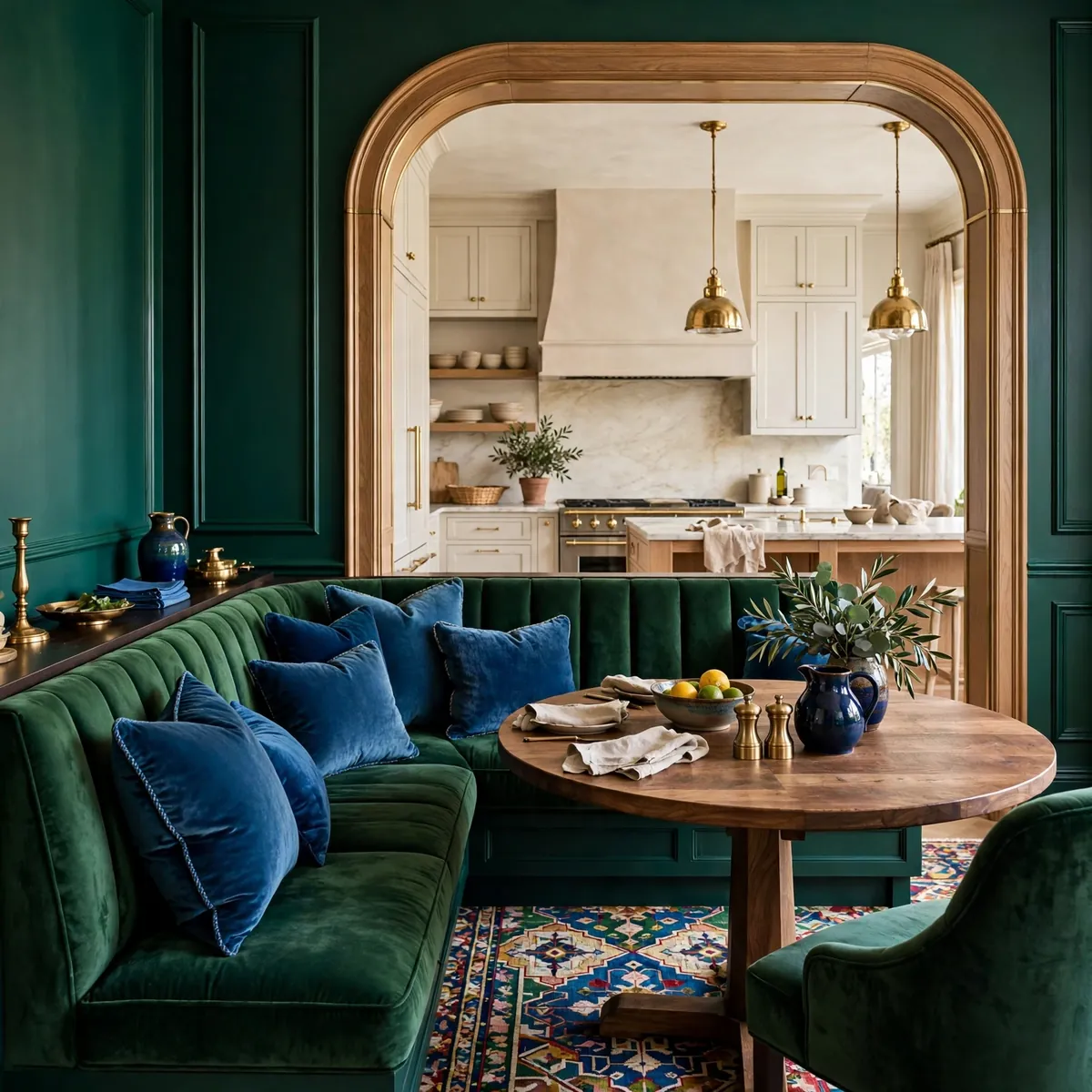
Confine the boldest color to the breakfast nook and the main kitchen can stay calm — nook-first colorful kitchen ideas like this one give you a jewel box without committing the whole room. Emerald banquette seating, sapphire cushions, or a ruby-painted beadboard wall turn the eating corner into a jewel box. Because the nook is a distinct zone, saturated color there feels deliberate — like a room within a room.
Quick tips
- Zone the nook with a rug so the color has boundaries.
- Repeat the jewel tone once in the main kitchen for flow.
19. Swap Hardware and Fixtures for Instant Color

The fastest of the colorful kitchen ideas costs almost nothing: swap cabinet pulls, the faucet, pendant shades, and switch plates for colorful versions. Enamel pulls in cherry red, a matte mustard faucet, cobalt pendant cords — small doses, big personality. If you hate it, everything unscrews.
Quick tips
- Change one category at a time (pulls first) to gauge the effect.
- Keep metals consistent — all brass or all black — so the colors stay the focus.
20. Let the Floor Do the Talking

Encaustic-look tiles or a painted floor in a bold pattern is the ultimate foundation move — floor-first colorful kitchen ideas let everything above stay simple because the floor carries the design. Black-and-white geometric, Mediterranean blue-and-white, or terracotta checkerboard — pick one pattern and let it be the room’s signature. Keep walls and cabinets quiet so the floor gets its moment.
Quick tips
- Patterned floors pair best with solid-color cabinets.
- Seal painted or encaustic floors properly in a working kitchen.
Frequently Asked Questions
How do I add color to my kitchen without making it look chaotic?
Give every color a job and a repeat. Pick one dominant color, one accent, and one neutral base — then repeat each accent at least twice in small doses. When colorful kitchen ideas look chaotic, it is usually because a color appears exactly once. Rhythm and repetition are what separate styled from scattered.
What colorful kitchen colors age the best?
Muted, nature-derived hues: sage, terracotta, dusty blue, warm ochre, deep navy. These read as color without shouting, so they stay lovable for years. Save the loudest brights — hot pink, acid yellow — for swappable elements like stools, art, and small appliances.
How much color is too much in a kitchen?
When no surface rests the eye. A good rule: at least half the room’s surfaces should stay calm (white, wood, stone), so the colorful moments have contrast to shine against. If everything is loud, nothing is.
Can colorful kitchen ideas work in a small kitchen?
Absolutely — small kitchens are ideal for bold color because one confident move covers the whole room. A single saturated wall, a colorful island, or a vibrant backsplash gives a compact kitchen huge personality. Keep the rest light and the room will feel bigger, not busier.
The Perfectly-You Finish
The best kitchen is not the one that looks perfect — it is the one that feels perfectly you. Pick the colorful kitchen ideas that match your energy, start with one confident move, and let the color grow from there. Magazine-worthy is not about rules; it is about a kitchen that makes you happy every single time you walk in. ♥