20 Stunning Two Tone Kitchen Cabinets That Look Designer-Made ♥ [Bold & Balanced]
Why Two Tone Kitchen Cabinets Are the Shortcut to a Designer Kitchen
Two tone kitchen cabinets are what separates a kitchen that looks assembled from one that looks designed. Instead of one flat color washing over every cabinet, two tones create deliberate contrast — a deep island against a light perimeter, dark lowers under airy uppers — and the room instantly gains depth, personality, and a custom feel that a single color rarely achieves.
Here is the definition worth holding onto: two tone kitchen cabinets simply mean using two different cabinet colors or finishes in one kitchen, usually split between the island and perimeter, or between upper and lower cabinets. Done well, the pairing feels intentional and balanced; done poorly, it reads as an accident. These 20 ideas show you the color combinations, splits, and balance rules that make two-tone design look effortless.
1. Pair a Deep Navy Island With a Light Perimeter
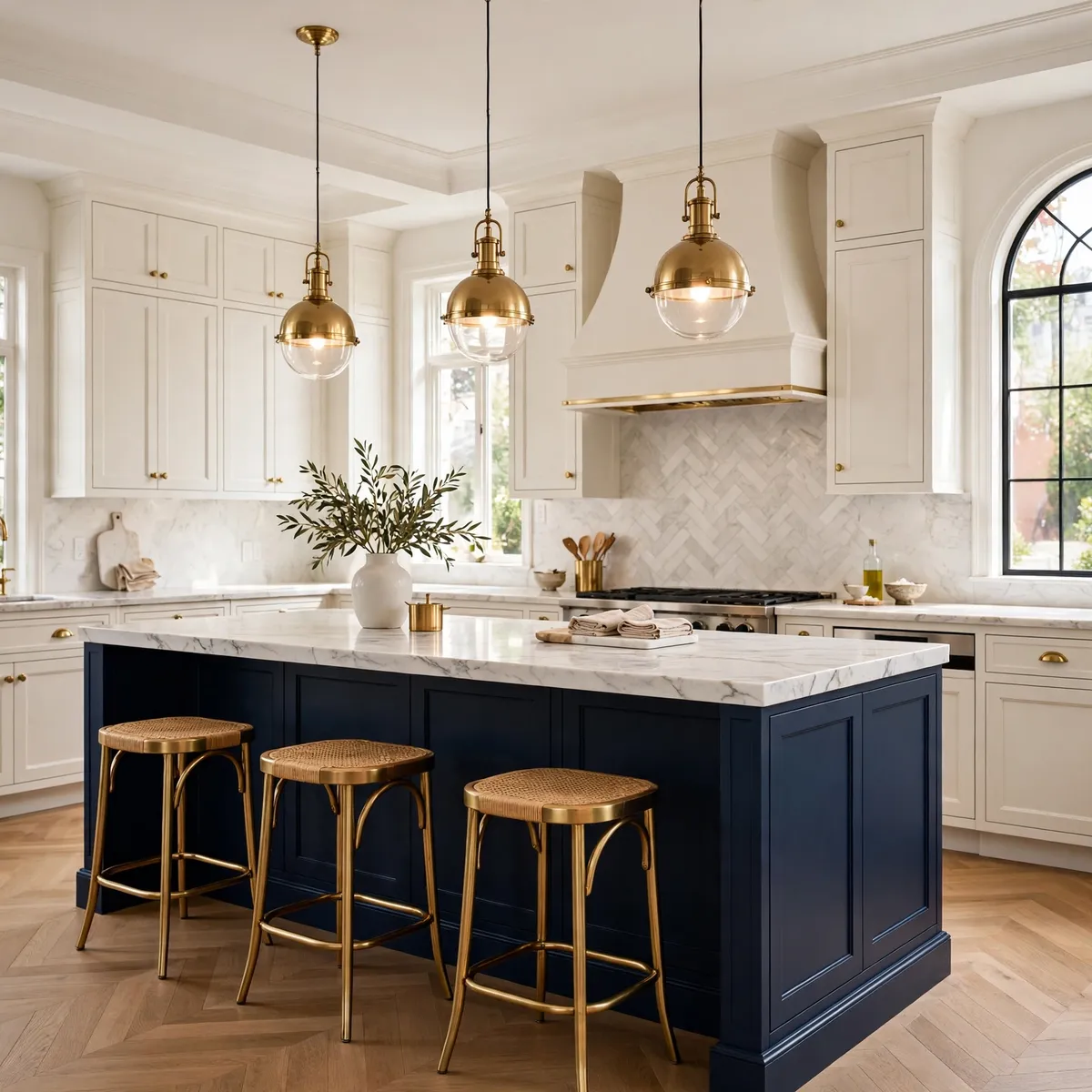
This is the classic entry point into two tone kitchen cabinets for a reason: a navy island anchors the room while warm-white perimeter cabinets keep it bright and open. The island becomes the furniture piece, the perimeter recedes, and the whole kitchen feels bigger and calmer than a fully dark room ever could.
Quick tips
- Echo the navy in one other place — barstools, a runner, or pendant cords.
- Keep the perimeter warm white, never stark white, next to navy.
2. Split Dark Lowers and Light Uppers
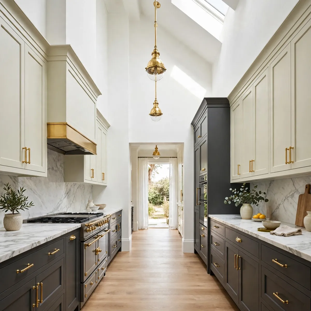
Painting only the lower cabinets a deep charcoal or forest green grounds the room, while pale uppers keep the top half feeling weightless. The eye travels up and the ceiling feels higher. This split is especially flattering in galley kitchens, where full-height dark cabinetry would close the walls in.
Quick tips
- Match the countertop to the uppers for one continuous light plane.
- Repeat the lower color in the island base for cohesion.
3. Try Sage Green Lowers With Warm White Uppers
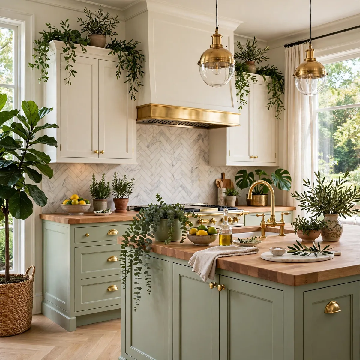
Sage is the friendliest dark tone — soft, organic, and forgiving. Sage lowers with warm-white uppers give you the grounding effect of a dark split without any of the heaviness, and the pairing works with brass, black, or nickel hardware. Among two tone kitchen cabinets ideas, sage photographs beautifully and ages even better.
Quick tips
- Sample sage in your own light; it swings gray or green easily.
- Butcher-block counters love this pairing.
4. Let a Black Island Ground an All-White Kitchen
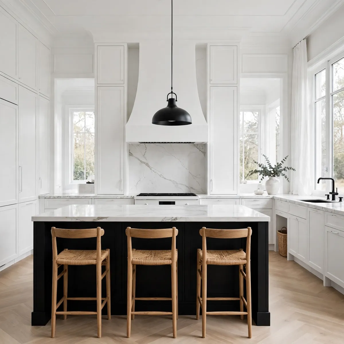
All-white kitchens sometimes float; a black island gives them a center of gravity. This is one of the most dramatic two tone kitchen cabinets moves you can make with a single piece of furniture — no full-room repaint required. Keep the island matte and the perimeter crisp, and add warmth through wood stools.
Quick tips
- Matte black hides fingerprints better than gloss.
- One black pendant over the island ties the move together.
5. Warm It Up With White Uppers and Walnut Lowers
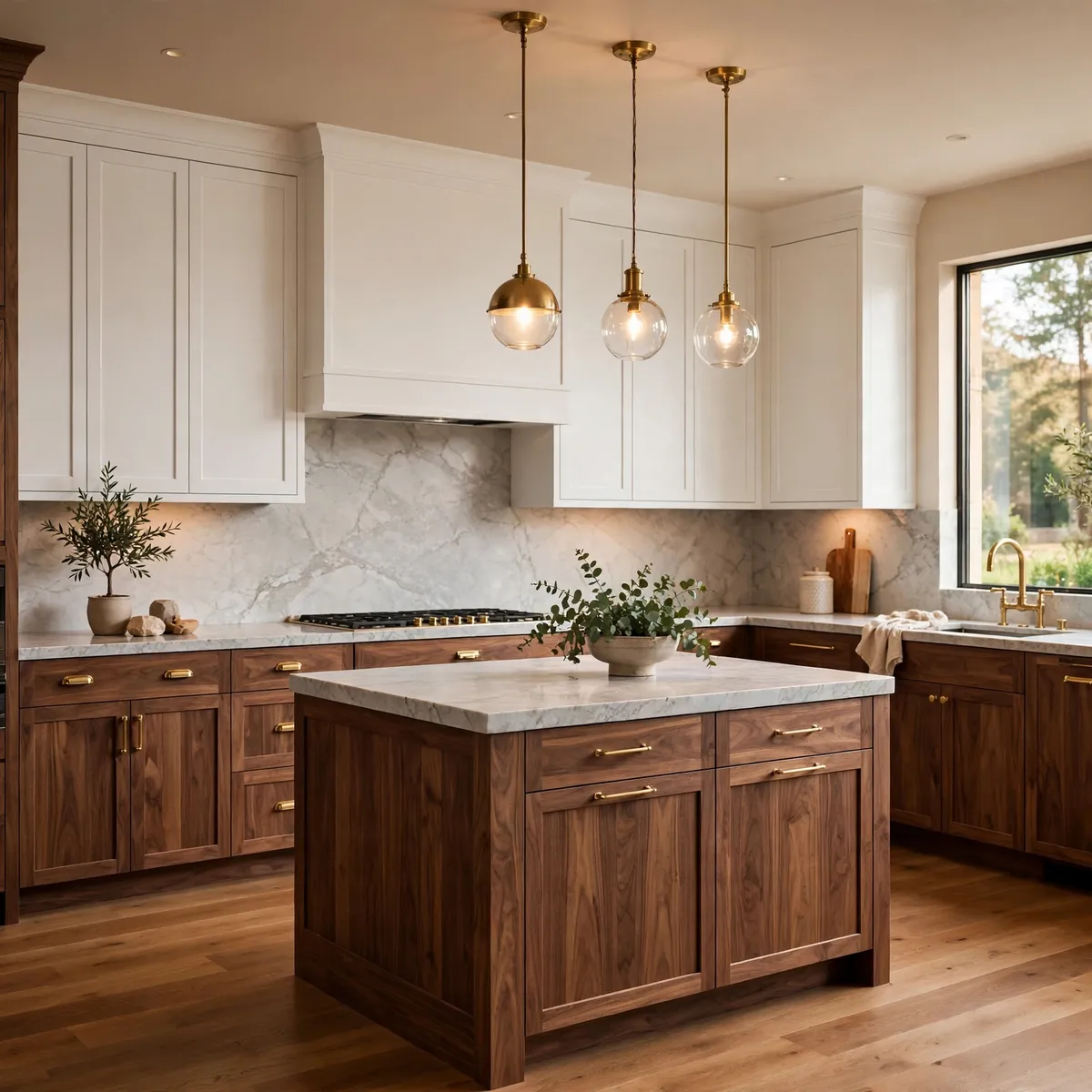
Wood counts as a tone too, and walnut is the most luxurious version. White uppers with walnut lowers deliver the two-tone contrast through material rather than paint — the grain does the decorating. This pairing feels warm, modern, and quietly expensive, especially with honed marble counters.
Quick tips
- Keep the walnut grain consistent across every run.
- Pale counters prevent the wood from reading heavy.
6. Go Bold With Deep Green Lowers and Cream Uppers
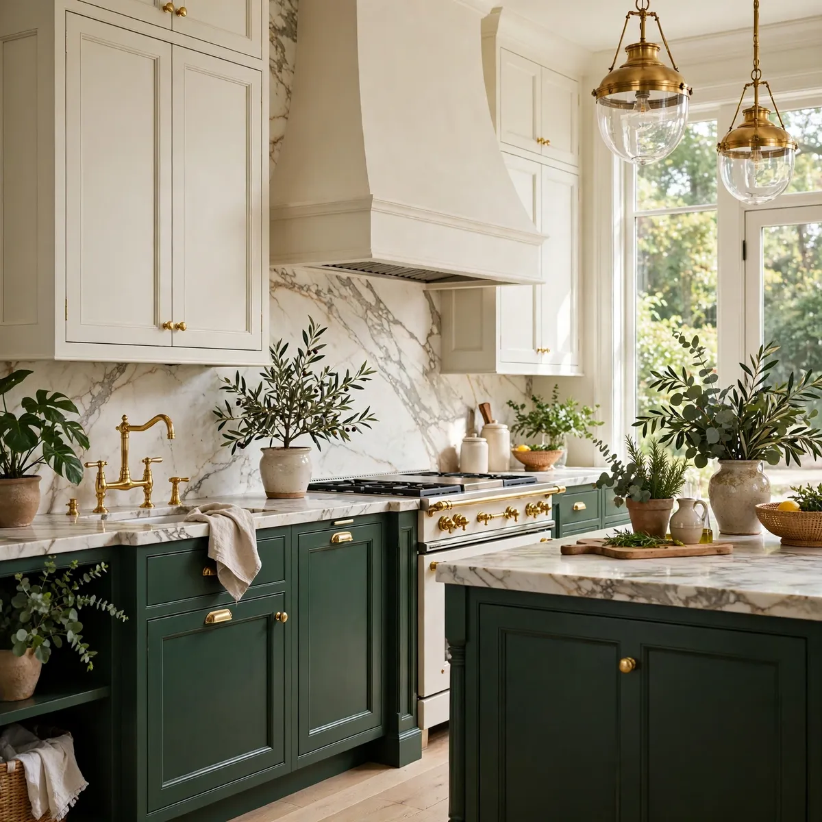
Deep forest green below, soft cream above — a pairing that feels botanical and calm at once. Green sits beautifully against both brass and black hardware, and it makes marble counters look richer. This combination flatters natural light especially well, glowing rather than darkening as the day moves.
Quick tips
- Keep both tones in the same undertone family so they harmonize.
- Matte paint with a glossy backsplash mixes finishes elegantly.
7. Energize With Olive Lowers and Cream Uppers
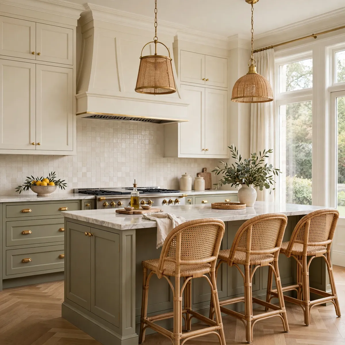
If you want energy without recklessness, olive green lowers bring freshness while cream uppers keep the room grounded and classic. The best two tone kitchen cabinets pairings often live in this middle zone — color that reads as character, not costume. Warm brass hardware and a neutral backsplash complete the fresh, classic charm.
- Choose muted olive over neon green for longevity.
- Pair with warm brass or muted gold hardware.
- Add woven textures — rattan stools, linen curtains — for warmth.
Quick tips
- Olive glows in natural light, so face it toward windows.
- Let the olive be the only strong color in the room.
8. Keep It Calm With Taupe Uppers and Charcoal Lowers
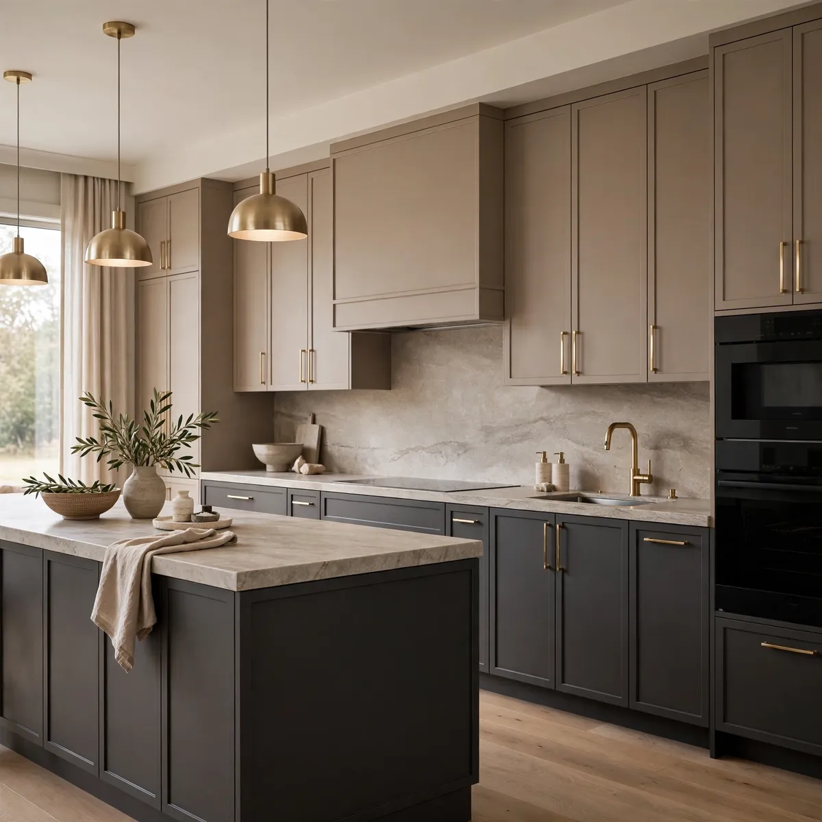
Warm taupe uppers with charcoal lowers is the grown-up version of two-tone: quiet, composed, and endlessly livable. Use matte finishes throughout and let texture carry the interest — stone counters, ceramic vases, a woven runner. Champagne-gold or brass hardware warms the charcoal just enough.
Quick tips
- Warm diffused lighting is essential; cool light flattens taupe.
- Prioritize texture over color in the styling.
9. Pair a Natural Oak Island With White Cabinets

An oak island against crisp white perimeter cabinets brings organic warmth without a drop of paint. The material contrast — matte white paint, natural grain, marble or quartz counters, soft brass — is one of the most reliable two-tone formulas in existence. A few subtle black touches add definition.
Quick tips
- Layer linen barstools, wooden boards, and woven baskets nearby.
- Seal the oak well; islands take the most wear.
10. Try Olive Lowers With Natural Wood Uppers
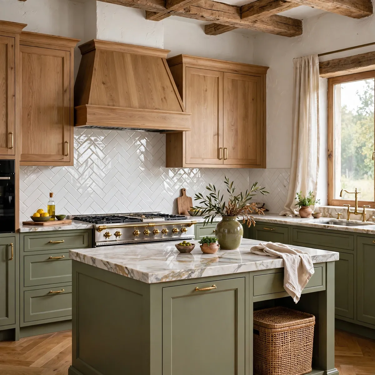
Painted olive lowers under natural wood uppers create rustic harmony — color and grain working as equal partners. Two tone kitchen cabinets do not always need white in the mix; here the wood IS the light tone. Keep both in the same warm undertone family and finish with marble or light gray counters.
Quick tips
- Brass or brushed nickel hardware both suit this pairing.
- Glossy backsplash tile bounces light off the wood.
11. Commit to Navy Bases With White Uppers
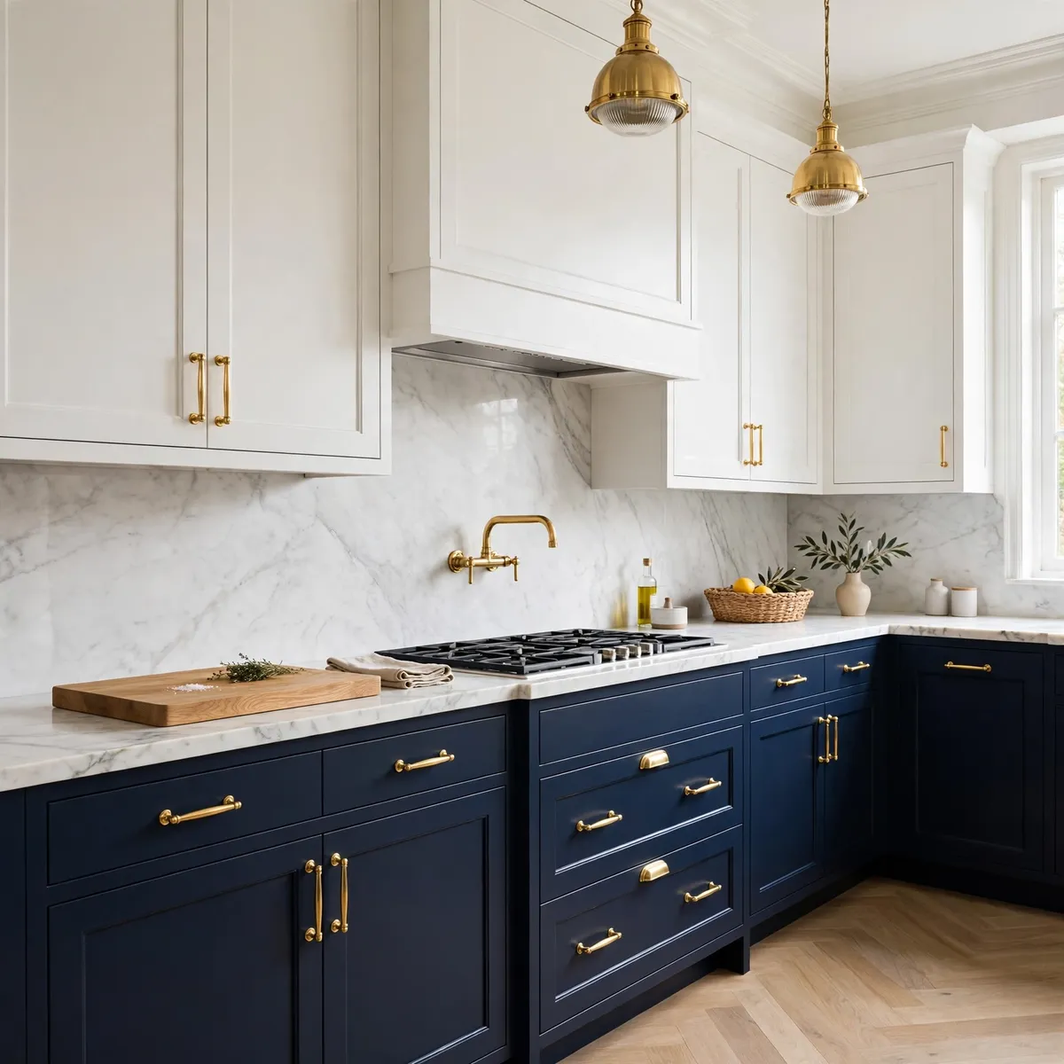
Beyond the navy island, full navy base cabinets with white uppers deliver bold-but-balanced two-tone in a bigger dose. Keeping darker hues below eye level grounds the room naturally. Warm metallics or wood accents keep the blue from reading nautical — think brass pulls and an oak cutting board on the counter.
Quick tips
- Nervous about commitment? Start with just the island first.
- White uppers need warm-white bulbs to avoid looking icy.
12. Warm Vintage Appeal With Cherry and Cream
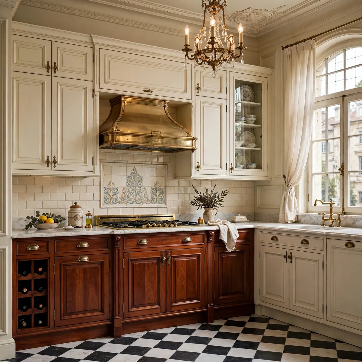
Cherry wood’s depth against soft cream cabinets brings a warm, vintage European feel that paint alone cannot match. Brushed bronze or antique brass hardware completes the story, and a checkered floor or subtle marble backsplash adds period charm. The red-brown cherry reads richer next to cream than it ever does alone.
Quick tips
- Let cherry be the star; keep other woods out of the room.
- Cream (not white) is the right partner for cherry’s warmth.
13. Soften the Room With Blush Pink Lowers
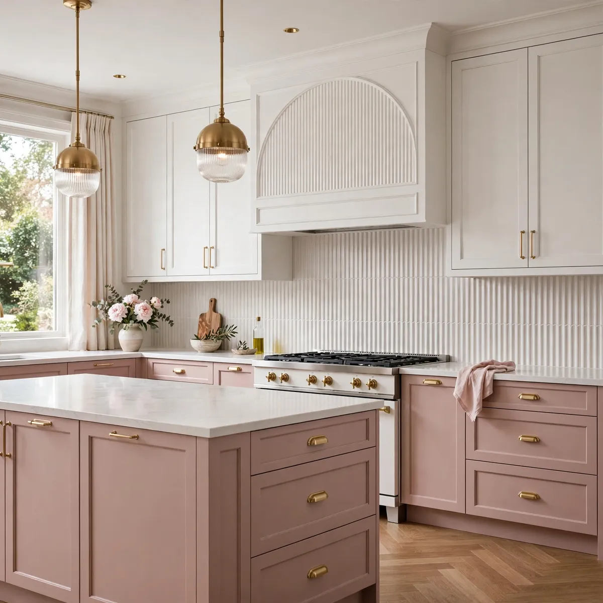
Blush pink lowers with white uppers are modern romance done right — soft, unexpected, and far more neutral than it sounds. White quartz counters and soft brass handles keep it refined; natural light makes blush glow. Two tone kitchen cabinets in blush work because the tone stays muted and dusty, never sweet.
Quick tips
- Add texture instead of extra color — fluted backsplash, woven stools.
- Keep the blush desaturated; chalky beats candy.
14. Go Cozy-Bold With Deep Red and Cream
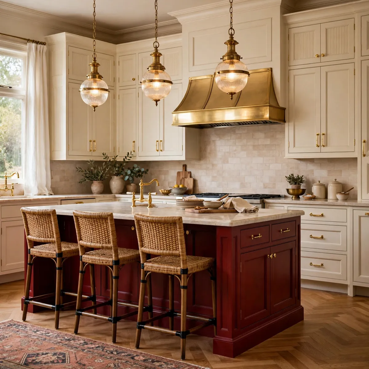
Deep oxblood red cabinetry against cream is cozy boldness — a kitchen with a pulse. Gold hardware or aged copper accents suit the richness, and light stone counters or pale flooring keep the red from closing in. Warm vintage-style pendants finish the mood; keep decor minimal and let the color be the focal point.
Quick tips
- Test red at full scale; swatches lie about saturation.
- One strong color means everything else stays quiet.
15. Try Terracotta Island With Neutral Surrounds

Terracotta is the earthy middle ground between bold and safe: warm, sunbaked, and endlessly flattering next to warm-white or greige perimeter cabinets. It brings a Mediterranean ease to two tone kitchen cabinets design and pairs beautifully with honed limestone counters and unlacquered brass.
Quick tips
- Repeat the terracotta in one textile for cohesion.
- Matte finishes keep terracotta earthy, not glossy.
16. Make the Pantry Wall the Accent Color
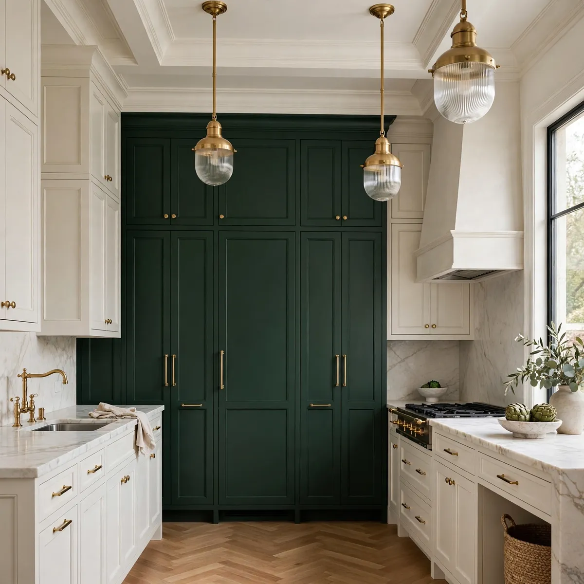
Instead of splitting the whole kitchen, paint one full-height pantry wall the bold tone — deep green, ink blue, or warm black — and keep every other cabinet quiet. Two tone kitchen cabinets concentrated in one place deliver maximum impact with minimum risk, and the accent wall becomes the room’s architecture.
Quick tips
- Carry the accent color onto the wall above the pantry for height.
- Keep surrounding cabinetry strictly neutral.
17. Stay Tonal: Two Shades of the Same Family
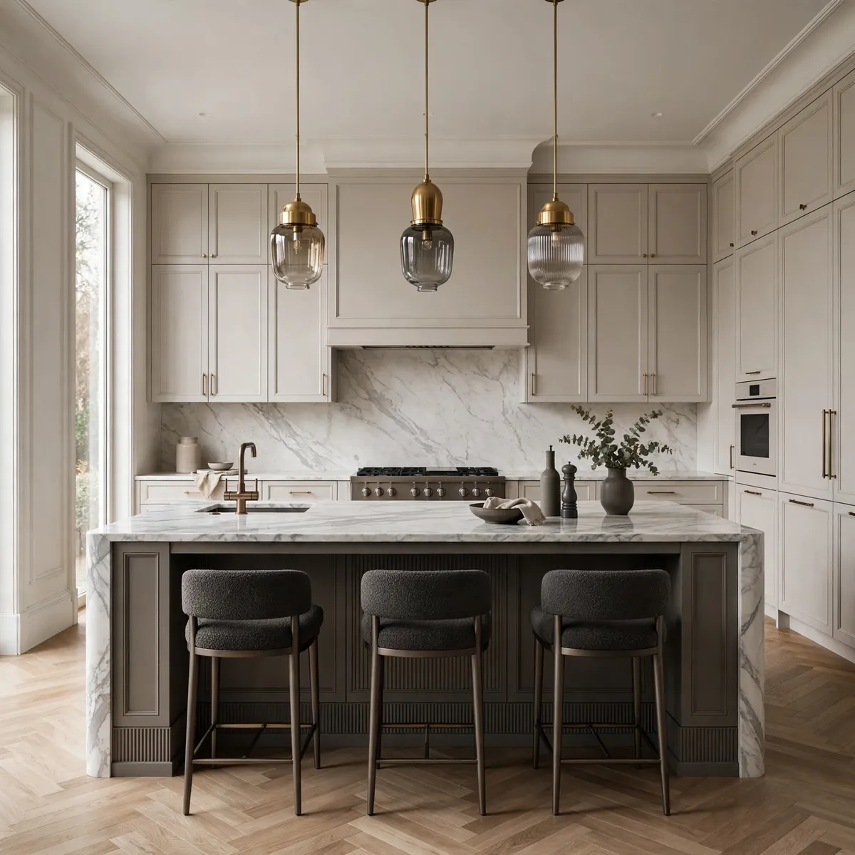
Two-tone does not have to mean high contrast. A darker greige island with lighter greige perimeter, or charcoal lowers with dove-gray uppers, creates depth through tone rather than color. This is the safest two-tone move and often the most sophisticated — variation you feel more than see.
Quick tips
- Keep both tones clearly in the same undertone family.
- Vary sheen slightly — matte island, satin perimeter — for depth.
18. Unite Both Tones With One Hardware Finish
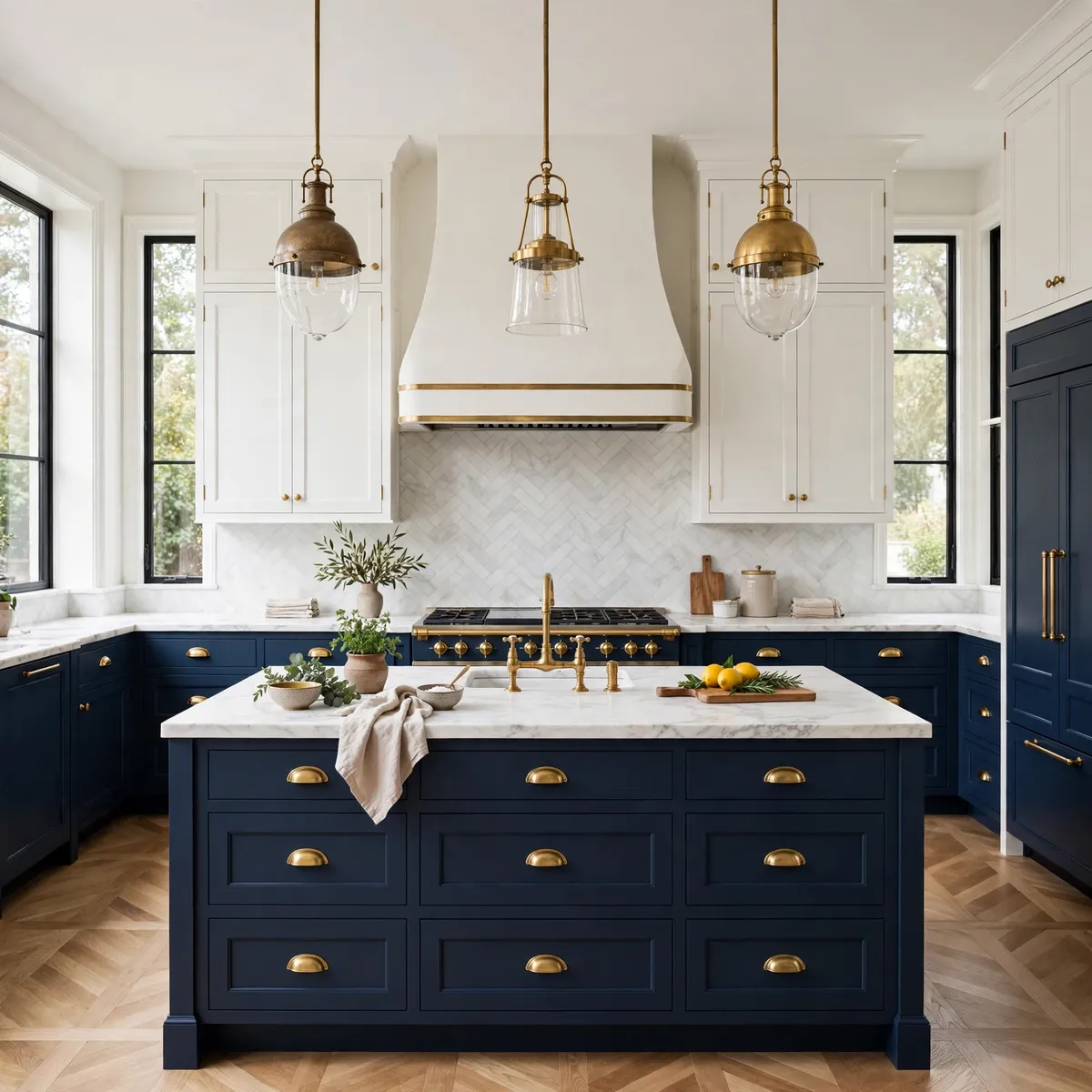
The fastest way to make any two-tone pairing look deliberate is a single hardware finish across both colors. One metal — unlacquered brass, matte black, or polished nickel — running over navy and white alike tells the eye the pairing was planned. The same discipline behind great minimalist kitchen ideas applies here: edit the metals, and the colors take care of themselves.
Quick tips
- Never mix metals across the two tones.
- Match the faucet to the hardware finish exactly.
19. Follow the 60-30-10 Balance Rule
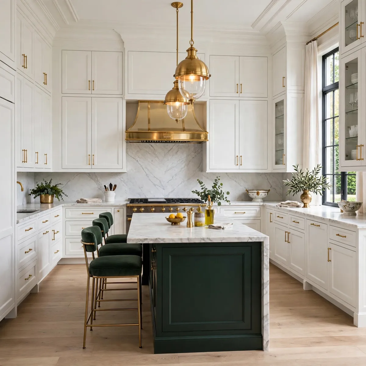
If two tone kitchen cabinets ever feel like they might tip into chaos, the 60-30-10 rule restores order, and understanding it is the difference between a kitchen that looks designed and one that looks accidental. Give roughly 60 percent of the visual weight to your dominant tone — usually the perimeter cabinets — about 30 percent to the secondary tone like the island or the lowers, and reserve the final 10 percent for an accent that ties them together, which might be the hardware finish, the countertop, or a repeated textile. When the dominant tone covers the walls of cabinetry and the secondary tone claims one confident zone, the eye reads the pairing as architecture rather than decoration, and the whole room feels settled. The rule also explains why most two-tone failures happen: two tones fighting at 50-50 with no clear leader, or three strong tones competing with no 10-percent peacemaker. Pick a leader, give it the room, let the second tone support, and choose one unifying accent — brass pulls, a stone counter, a runner that echoes both colors — to close the loop. Follow that proportion and nearly any color pairing lands.
Quick tips
- When in doubt, make the lighter tone the 60-percent leader.
- The 10-percent accent should touch both cabinet tones.
20. Tie It Together With Counters and Flooring
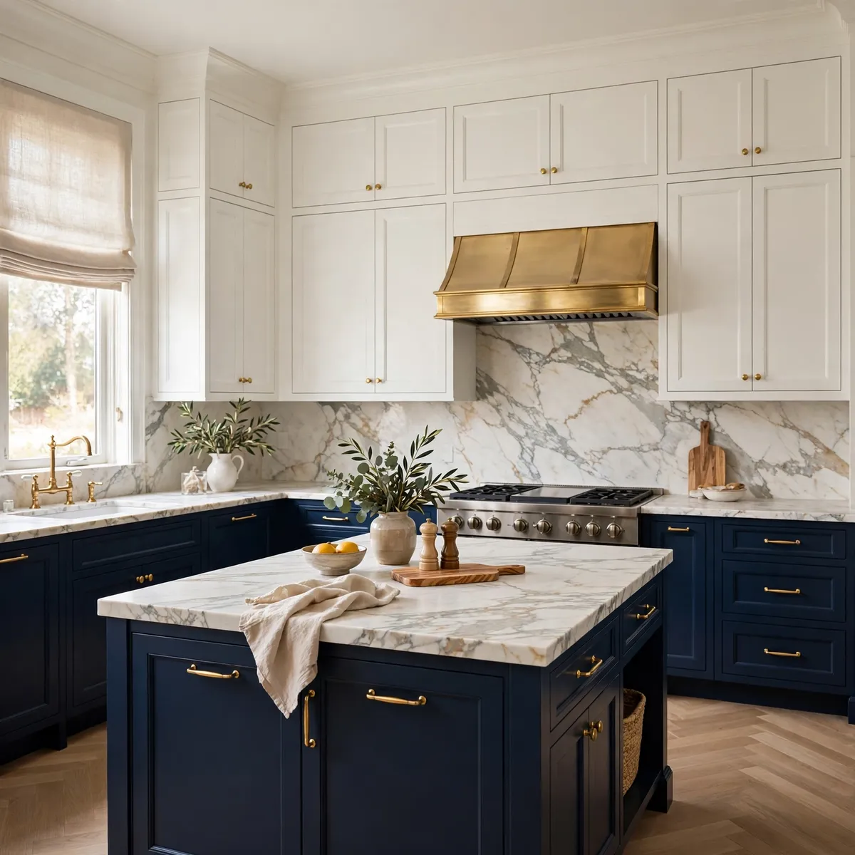
Counters and floors are the diplomats of a two-tone kitchen. A countertop that picks up both cabinet colors — veined marble with gray and cream, butcher block warming dark lowers — bridges the split silently, which is why material choice matters as much in two tone kitchen cabinets as the paint colors themselves. Flooring in a neutral middle tone keeps either color from dominating. Choose these surfaces to connect, not compete.
Quick tips
- Sample counters against both cabinet colors, not just one.
- Neutral flooring lets you change cabinet tones later.
Frequently Asked Questions
What colors work best for two tone kitchen cabinets?
The most reliable pairings put a deep tone against a light neutral: navy or forest green with warm white, charcoal with cream, black with white. Two tone kitchen cabinets also work beautifully with wood as one of the tones — walnut, oak, or cherry against painted cabinetry. Keep both tones in a compatible undertone family and unify them with one hardware finish.
Should the island or the perimeter be darker?
Usually the island — a darker island anchors the room while the lighter perimeter keeps walls feeling open. The exception is the upper-lower split, where dark lowers with light uppers achieve the same grounding. Two tone kitchen cabinets fail most often when the dark tone climbs to the ceiling and closes the room in.
Are two tone kitchen cabinets still in style?
Yes — two-tone has moved from trend to classic because it is really just contrast, and contrast never dates. What changes is the palette: today’s favorites are deep greens, warm taupes, and natural woods rather than the gray-and-white pairings of a decade ago. The structure — one dominant tone, one supporting tone — stays the same.
How do I make two-tone cabinets look cohesive instead of random?
Follow three rules: give one tone about 60 percent of the visual weight so there is a clear leader; use one hardware finish across both tones; and choose counters or flooring that touch both colors. Two tone kitchen cabinets look random when two colors fight at equal strength with nothing unifying them — the 60-30-10 proportion plus a shared accent fixes that instantly.
The Balanced Takeaway
Two tones turn a kitchen from assembled to designed — but only when one tone leads and the other supports. Pick your pairing, give the lighter tone the room, unify with one metal, and let the counters bridge the split. If one color makes a kitchen beautiful, two done right make it unforgettable. ♥