The Colorful Living Rooms That Made Us Rethink Everything We Thought About Color
Colorful living rooms can feel warm, expressive, and surprisingly timeless when every strong shade has a reason to be there. The trick is not choosing fewer colors; it is giving those colors a clear relationship through furniture, artwork, rugs, lighting, and texture.
If you have always treated bold color as a risky finishing touch, it may be time to reverse that approach. Start with the feeling you want the room to create, choose one confident anchor, and let the rest of the space build around it. These colorful living rooms show how different palettes can feel polished without becoming predictable.
1. Build the Room Around a Jewel-Tone Sofa
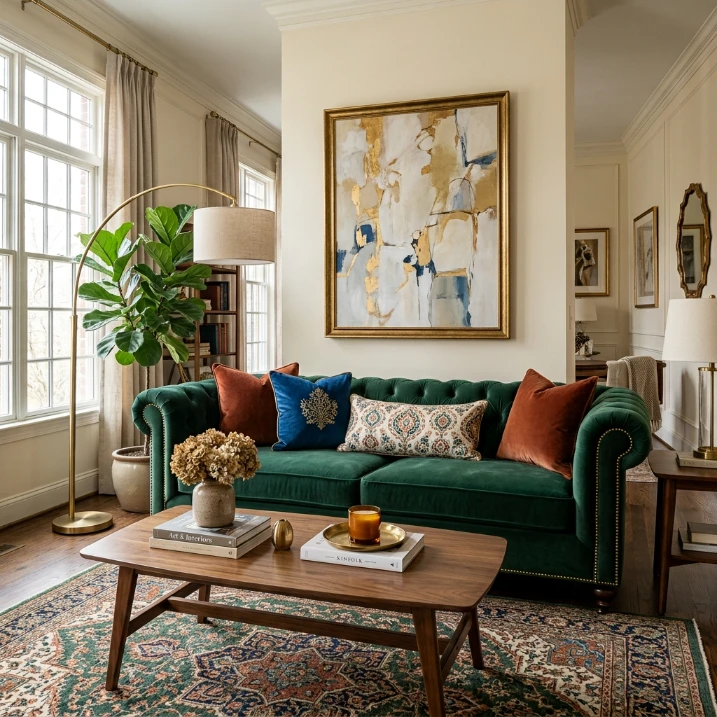
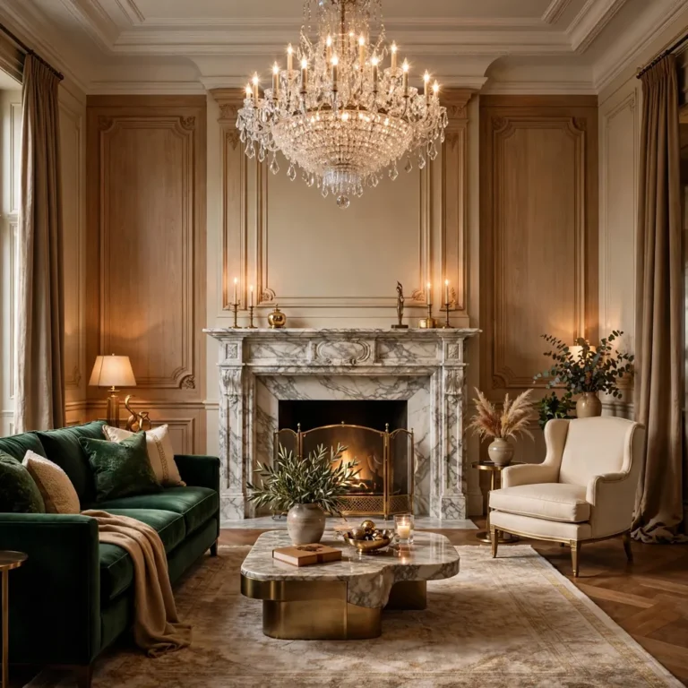
A jewel-tone sofa can become the visual starting point for the entire room. Emerald green, sapphire blue, ruby red, or rich aubergine gives a neutral architectural shell an immediate sense of character. Instead of matching every accessory to the sofa, choose two supporting shades and repeat them in smaller pieces.
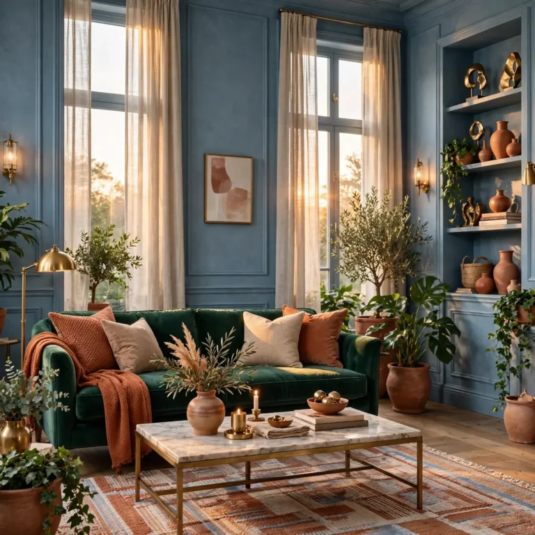
An emerald sofa can sit beside a rust-colored throw, a patterned rug with touches of cream, and artwork containing muted blue. The colors do not need to match exactly. Similar depth and saturation are enough to make the room feel intentional.
2. Try Color Blocking With Two Strong Wall Shades

Color blocking is an easy way to make a living room feel designed rather than simply decorated. Paint the lower half of a wall in deep blue and the upper section in soft clay, or use one saturated color on the main wall and a second shade inside a reading nook.
Keep the furniture simpler when the walls are doing the work. Natural wood, cream upholstery, and a restrained rug can give the eye a place to rest while the paint creates the personality.
3. Let a Multicolor Rug Become the Palette Guide

A colorful rug can solve one of the hardest parts of decorating with several hues: deciding which colors belong together. Choose a rug containing three to five shades you genuinely love, then pull individual colors into cushions, curtains, artwork, or a chair.
This method is especially useful if you are decorating gradually. Rather than buying a matching set, allow the rug to act as the common thread between pieces collected at different times.
4. Pair Warm Orange With Soft Pink
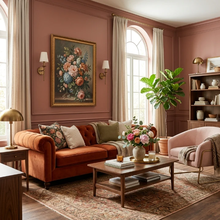
Orange and pink create a lively combination without automatically feeling childish. A burnt-orange sofa or armchair works beautifully with dusty rose walls, blush textiles, or a pale pink accent chair. Balance one energetic shade with a softer version of the second.
Add aged brass, walnut, or natural woven materials to give the palette more maturity. These textures make the colors feel layered and comfortable instead of overly sweet.
5. Make Blue the Calm Color in a Bold Room

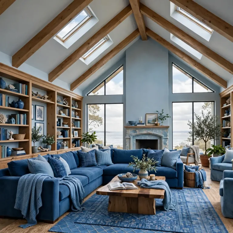
Blue can act as the stabilizing shade in a colorful scheme. Cobalt, petrol blue, or deep teal can anchor brighter yellow, coral, green, or pink accents while still giving the room plenty of energy.
Try a blue sectional with a sunny yellow lamp, botanical artwork, and a warm wood coffee table. Because the blue carries visual weight, the brighter accents can stay relatively small and still make an impact.
6. Use an Unexpected Ceiling Color

The ceiling is often the forgotten surface in a living room, which makes it an excellent place for a confident color choice. A muted terracotta, pale green, warm lavender, or soft ochre can make the entire room feel more finished without adding another busy wall.
If the ceiling is bold, repeat a tiny amount of that shade somewhere below, such as in a cushion, vase, or artwork. That small connection makes the ceiling feel like part of the design rather than an isolated statement.
7. Mix Color Through Vintage and Modern Pieces

Color becomes more interesting when the furniture does not all come from the same visual era. Place a modern curved sofa beside a vintage cabinet, an antique-style mirror, or a colorful secondhand chair.
The variation in shape and material keeps the room from looking like a showroom. Use color to connect the pieces: an old cabinet can repeat the green in the rug while a modern lamp echoes the chair upholstery.
8. Turn a Gallery Wall Into a Color Story
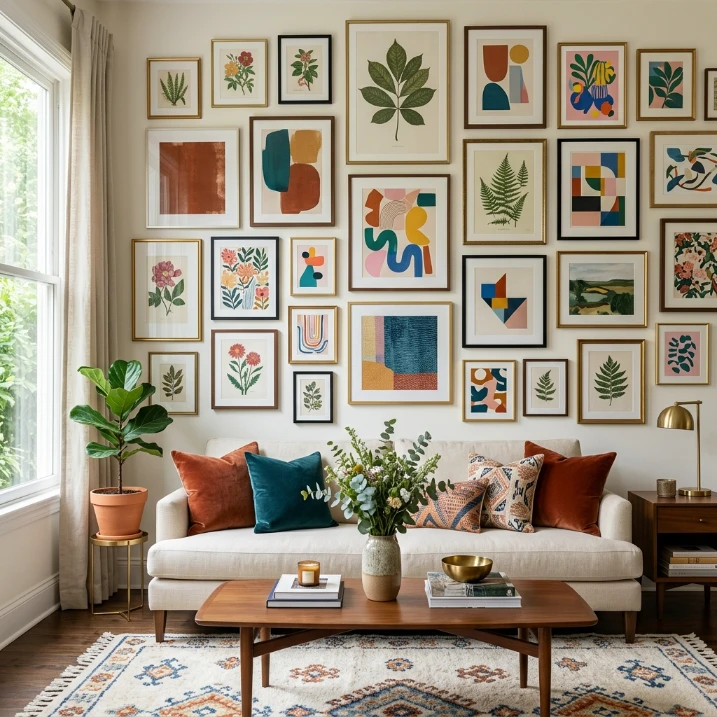
A gallery wall does not have to be a collection of identical frames or neutral prints. Choose artwork with a shared color family and vary the scale, subject, and frame style. A mix of botanical illustrations, abstract shapes, landscapes, and graphic prints can feel cohesive when several colors repeat.
Leave enough breathing room around the artwork. Colorful walls usually look stronger when the collection has an intentional boundary instead of expanding into every available inch.
9. Bring in Green With Plants Instead of More Accessories

Plants are one of the easiest ways to add another color without making the room feel artificially decorated. Fiddle-leaf figs, palms, trailing pothos, and rubber plants bring different shades of green and introduce organic shapes.
Use plants to soften corners, frame a sofa, or balance a colorful cabinet. Terracotta pots, woven baskets, and simple ceramic planters also add texture without competing with the main palette.
10. Give a White Room One Highly Saturated Corner

You do not need to repaint the entire living room to create a colorful look. Keep most walls white or warm ivory and make one zone unusually bold. A cobalt reading chair, coral cabinet, green built-in, or bright patterned curtain can become the focal point.
This approach works especially well in smaller rooms because the surrounding light surfaces preserve a sense of openness. It is also easy to change when your taste evolves.
11. Use Colorful Lighting for an Evening Mood

Lighting can introduce color without permanently changing the architecture. Glass pendants in amber, green, blue, or pink can become sculptural accents during the day and create a warmer atmosphere after sunset.
Keep the rest of the lighting warm and layered. A floor lamp, table lamp, and ceiling fixture can create several levels of illumination, helping saturated furniture and wall colors look inviting rather than flat.
12. Combine Bold Color With Natural Materials
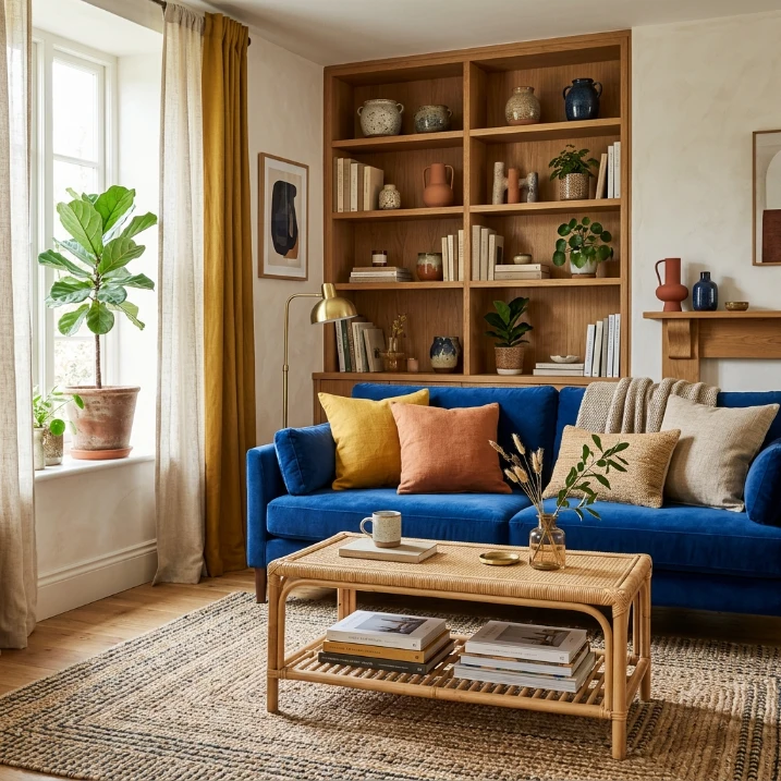
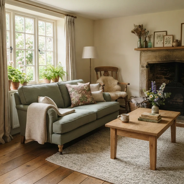
When a palette starts to feel too intense, natural materials can bring it back to earth. Wood, rattan, linen, cane, jute, stone, and handmade ceramics all work well beside strong colors because their texture adds visual calm without forcing the room back into beige.
A cobalt sofa with a woven coffee table, for example, feels very different from the same sofa surrounded by glossy synthetic surfaces. Texture changes how color is experienced.
13. Create a Dark and Colorful Living Room

Color does not have to mean bright white walls and cheerful accents. A charcoal, chocolate, or deep navy background can make saturated furnishings look richer. Add mustard, berry, teal, rust, or emerald in controlled doses.
Use warm lamps and reflective details such as brass, glass, or a lightly reflective artwork frame to keep the darker palette welcoming. This is a strong option for anyone who wants colorful living room ideas with a moodier character.
14. Keep the Furniture Neutral and Let Accessories Rotate
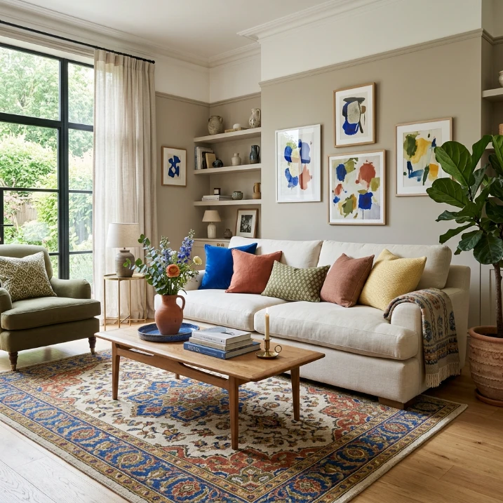
If you love changing your decor, keep the major furniture pieces in versatile shades such as cream, camel, tan, or warm gray. Then use cushions, rugs, art, throws, and ceramics to create different color stories throughout the year.
You might use terracotta and olive in one season, then switch to cobalt and butter yellow later. This approach makes experimenting with color less expensive and much easier to maintain.
15. Repeat One Accent Color Across the Room
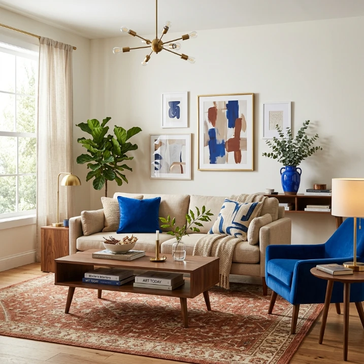
The simplest way to make a colorful living room feel cohesive is repetition. Pick one accent shade and place it in at least three areas: a cushion near the sofa, a piece of art on the opposite wall, and a small ceramic object on a shelf.
The repeated color does not need to dominate. Its job is to create visual links so the room feels connected as you move your eyes around it.
How to Make Colorful Living Rooms Feel Cohesive
A successful colorful living room usually has a simple underlying structure. Start with one anchor color, add one or two supporting shades, then introduce a small number of contrasting accents. Repeat important colors instead of introducing a new hue every time you add an accessory.
- Choose a starting point: a sofa, rug, artwork, wall color, or favorite chair.
- Limit the main palette: three to five meaningful colors are often enough.
- Balance saturation: pair very bright shades with calmer versions or grounding neutrals.
- Use texture: wood, linen, velvet, rattan, and ceramics can soften strong color.
- Protect visual rest areas: not every wall, shelf, or surface needs to be colorful.
Final Thoughts on Colorful Living Rooms
The best colorful living rooms are not colorful simply for the sake of being bold. They feel personal because the palette has been built around choices that make the room enjoyable to live in. A dramatic sofa, a painted ceiling, a collected gallery wall, or even one brightly colored chair can be enough to change the character of the space.
Start with the color you would be happiest seeing every day. Then build slowly around it, repeating shades where they help and leaving quiet areas where they do not. That is how a room can be vibrant without becoming visually exhausting.